Paramount Bank: Digital Banking, End to End
Designing a bank's new web and mobile banking platform, from opening an account to sending a wire.
- Personal + Biz
- Account Opening Flows
- ACH + Wires
- Money Movement & Disclosures
- Dec 2026
- iOS & Android Launch
1. Designing an Everyday Digital Bank from a Blank Canvas
Paramount Bank came to us with a clear goal: build a modern digital bank from scratch—Paramount Every Day Banking—where personal and business customers could open an account, check balances, link external banks, and send ACH transfers or wires entirely online without ever needing to visit a branch.
As the sole product designer at Jassby, I took that vision from our CTO's initial roadmap to a complete web and mobile banking platform—and I am now leading my own Jira epic (Web Redesign), authoring the epic and user stories in Jira, and actively building out the React front-end in my own design-test Git branch (using Claude, Cursor, and Figma Make) ahead of merging with our engineering team. Putting working front-end code and clickable prototypes directly into the hands of our engineers, compliance officers, and bank partners has turned complex banking rules, two-step security checks, and wire cutoff disclosures into a shared language as we build toward launch.
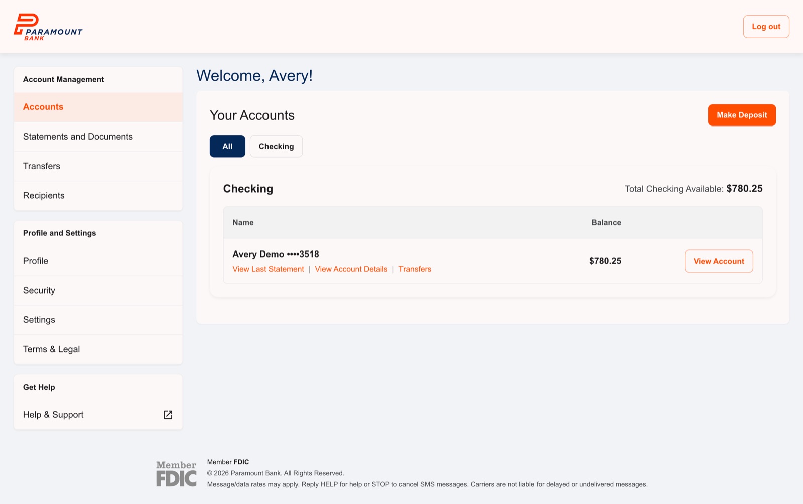
What's in the MVP
| Area | What I designed |
|---|---|
| Opening a personal account | Contact verification, employment, home address, identity, agreements, instant approval |
| Opening a business account | Business details, authorized representative and guarantor, owners of 25% or more, ownership certification |
| Everyday banking | Sign-in with two-step verification, dashboard, transactions, account details |
| Moving money | Deposits from another bank, ACH transfers, wires, saved recipients |
| Documents | Statements, tax documents, signed agreements |
| Account settings | Profile, security, statement and alert settings |
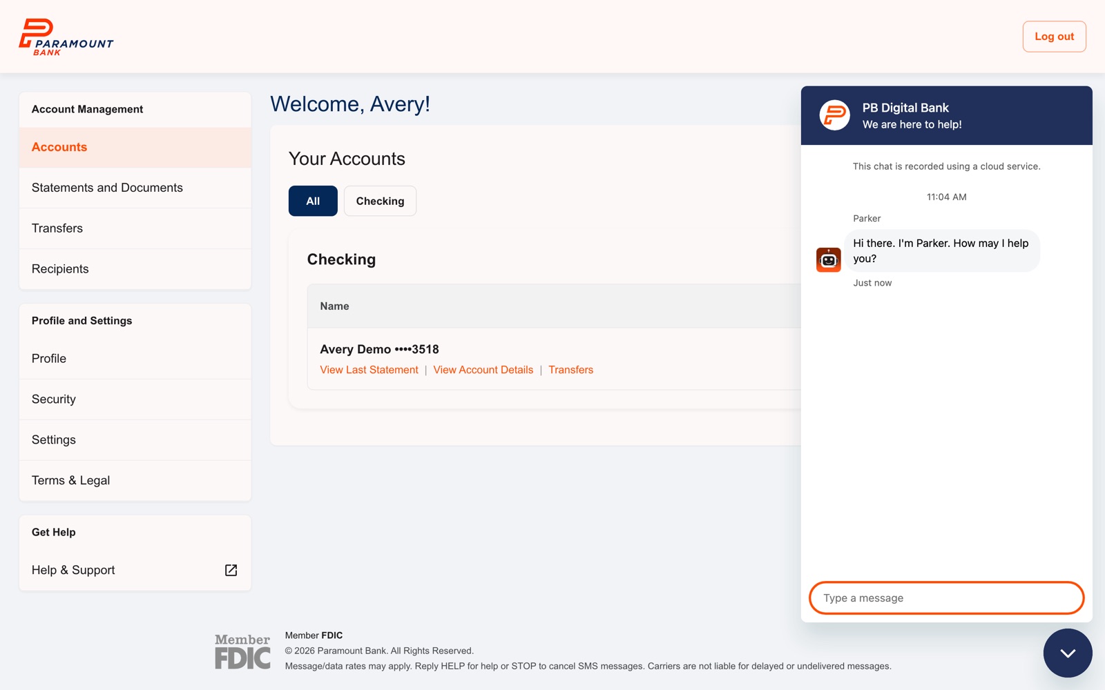
| Help | Parker, our chat assistant |
All names, accounts, and amounts in these screens are test data. SSNs and EINs are masked.
2. The Rule Behind Every Screen
"Before we show sensitive information or move money, we confirm it's really you. And before you send anything you can't take back, you see exactly what's leaving, where it's going, and what it costs."
Banking software fails people in two ways: it's either so locked down that simple tasks feel like a fight, or it's so smooth that someone sends $2,000 to the wrong account. I wanted security to show up at the moments where it actually protects people, and nowhere else.
3. Opening an Account
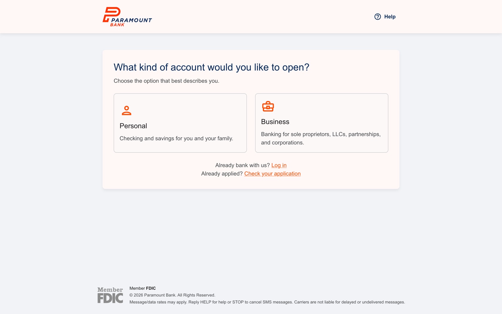
The first screen asks one question: personal or business. Both paths share the same building blocks (contact verification, eSign consent, identity, agreements) but ask for very different things after that.
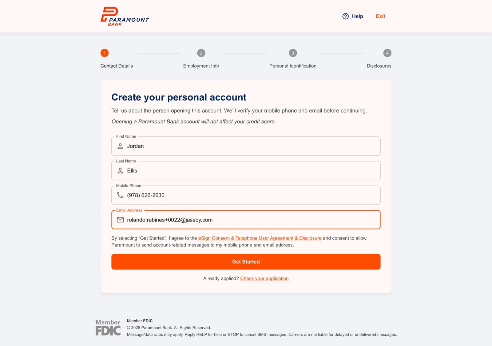
Personal: instant approval
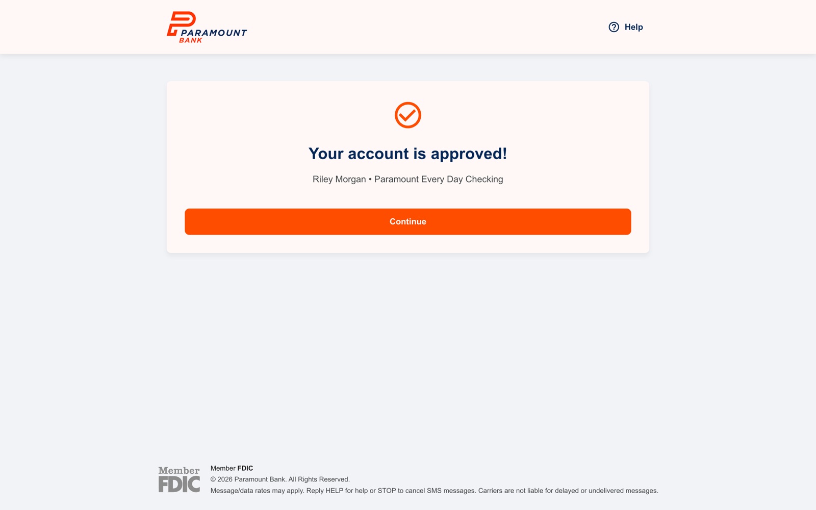
After contact verification, a personal applicant gives their occupation, home address, and identity, then agrees to the Deposit Account Agreement. Most people get a decision on the spot. From there they pick how they want to receive login codes, create a password, and land on their new dashboard.
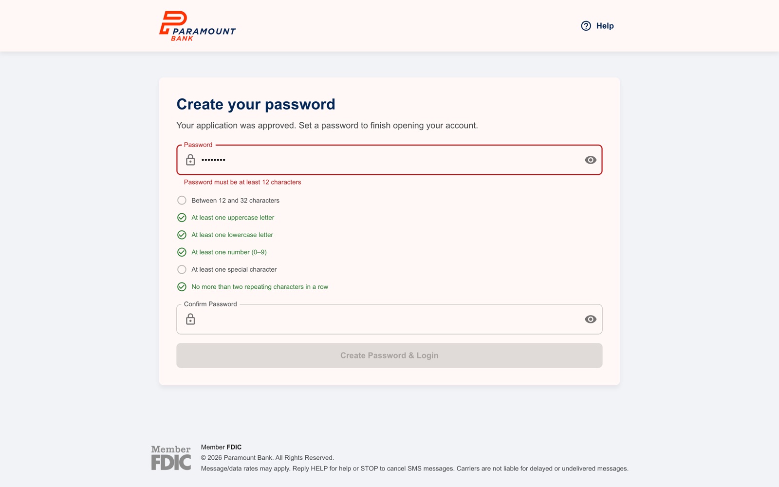
The password screen checks each rule as you type, so people see exactly what's missing instead of getting a generic error after they hit submit.
Business: five clear stages
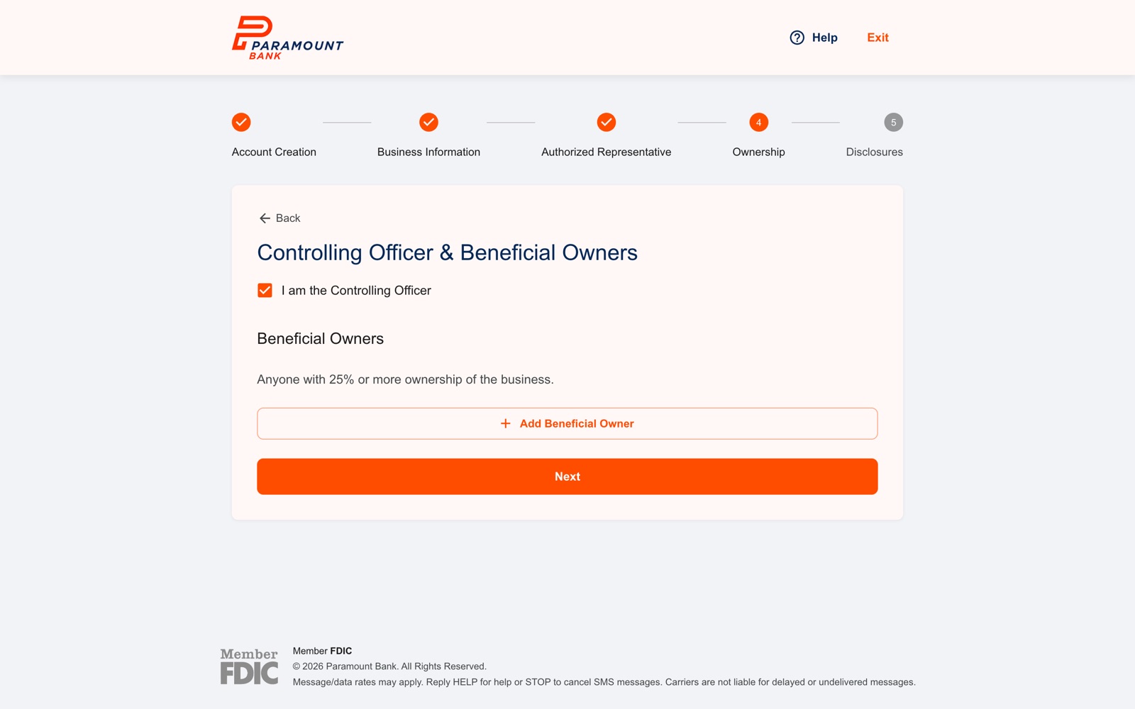
Business accounts carry federal requirements a personal account doesn't: the bank has to know who can act for the company, who controls it, and everyone who owns 25% or more. I split it into five labeled stages (Account Creation, Business Information, Authorized Representative, Ownership, Disclosures) so a business owner always knows how far they are from done.
A few details that save people time:
- "I am the Controlling Officer." In most small businesses, the person applying is also the person running the company. One checkbox reuses what they've already entered instead of asking for it twice.
- Masked EINs. Tax IDs are hidden as soon as they're entered.
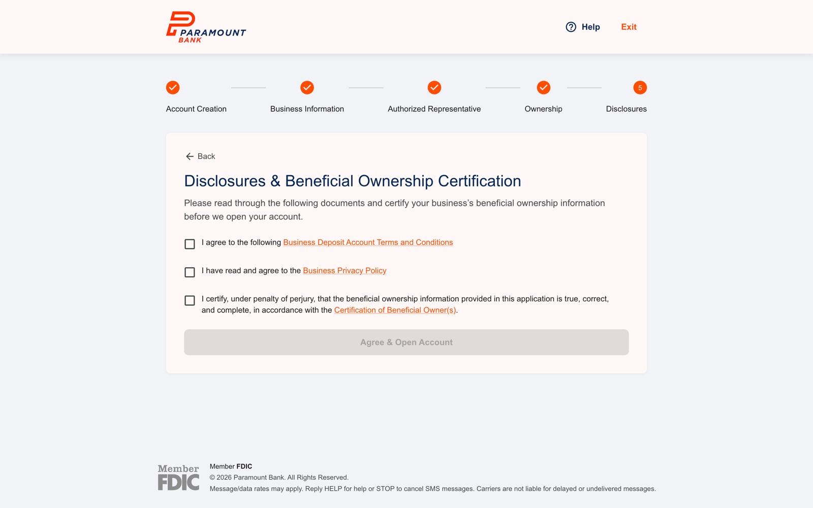
- Plain-language certification. The last step lists exactly what they're agreeing to, including certifying their beneficial ownership information, before the account opens.
4. Security Where It Counts
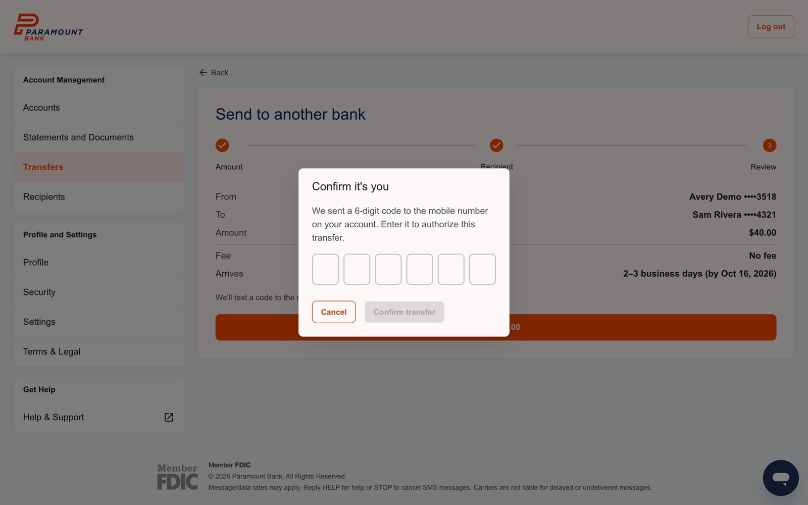
Every customer signs in with a password and a one-time code. After that, we ask for another code only at moments that matter:
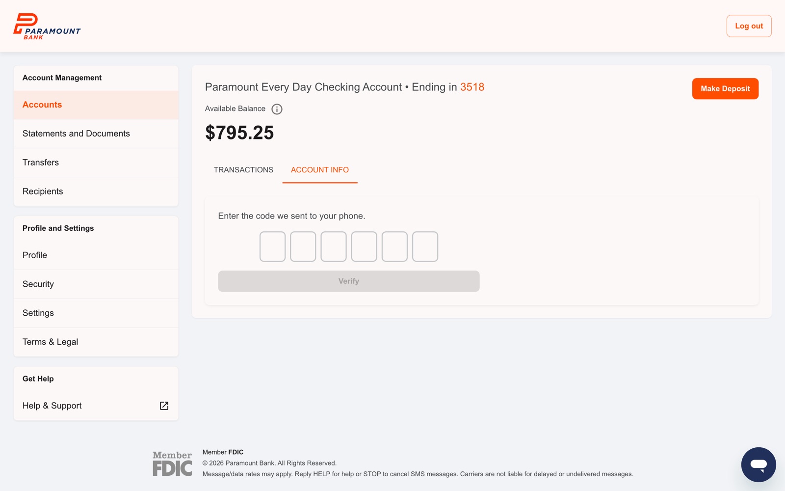
- Before showing full account and routing numbers. The Account Info tab stays locked until you enter a code sent to your phone.
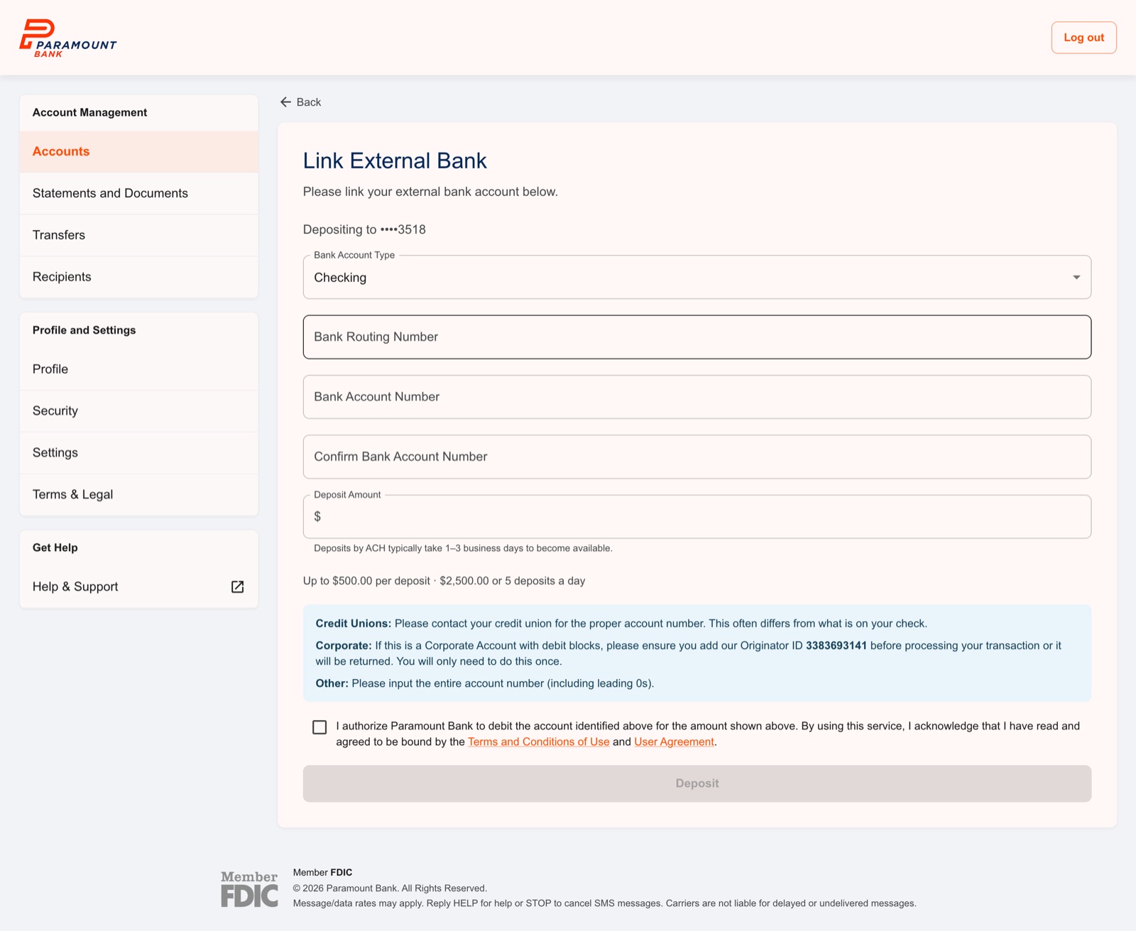
- Before any money moves. Deposits from another bank, ACH transfers, and wires each end with a one-time code.
- Before changing contact details. Updating your phone number asks for your password first.
5. Moving Money
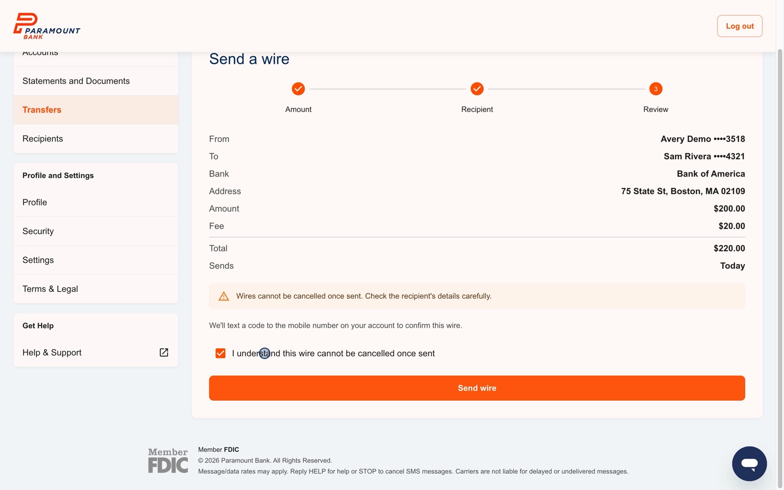
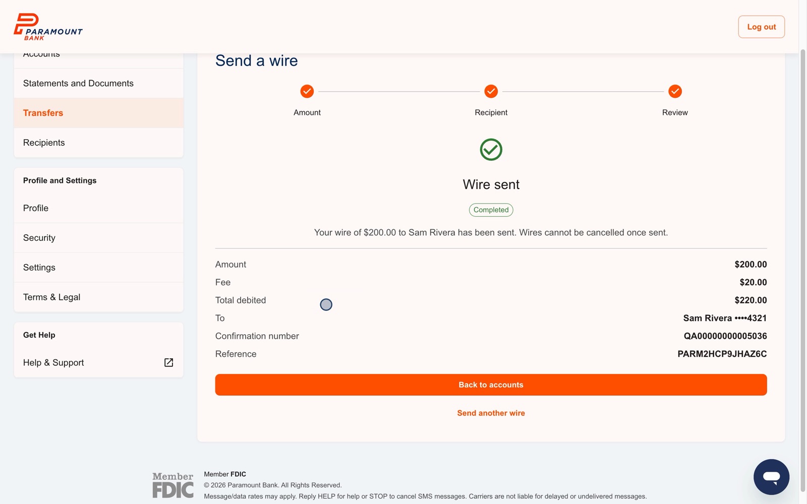
ACH transfers and wires follow the same three steps: Amount → Recipient → Review. Keeping them identical means someone who has sent one transfer already knows how to send a wire.
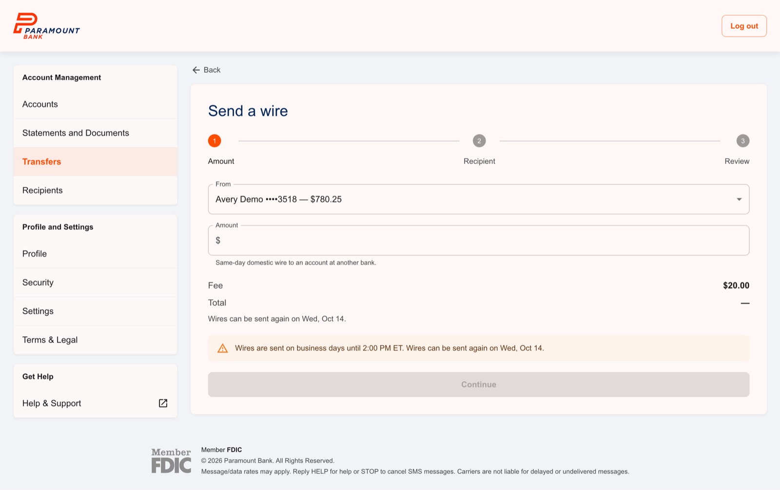
Wires get extra care because they can't be reversed:
- The full cost before you commit. Amount, the $20 fee, and the total are on the first screen, not buried on the last one.
- A clear warning and an explicit acknowledgment. "Wires cannot be cancelled once sent," plus a checkbox the customer has to tick before the Send button works.
- Cutoff times stated up front. After 2:00 PM ET, the form says when the wire will go out instead of letting someone fill it in and find out at the end.
6. Designing the Unhappy Paths
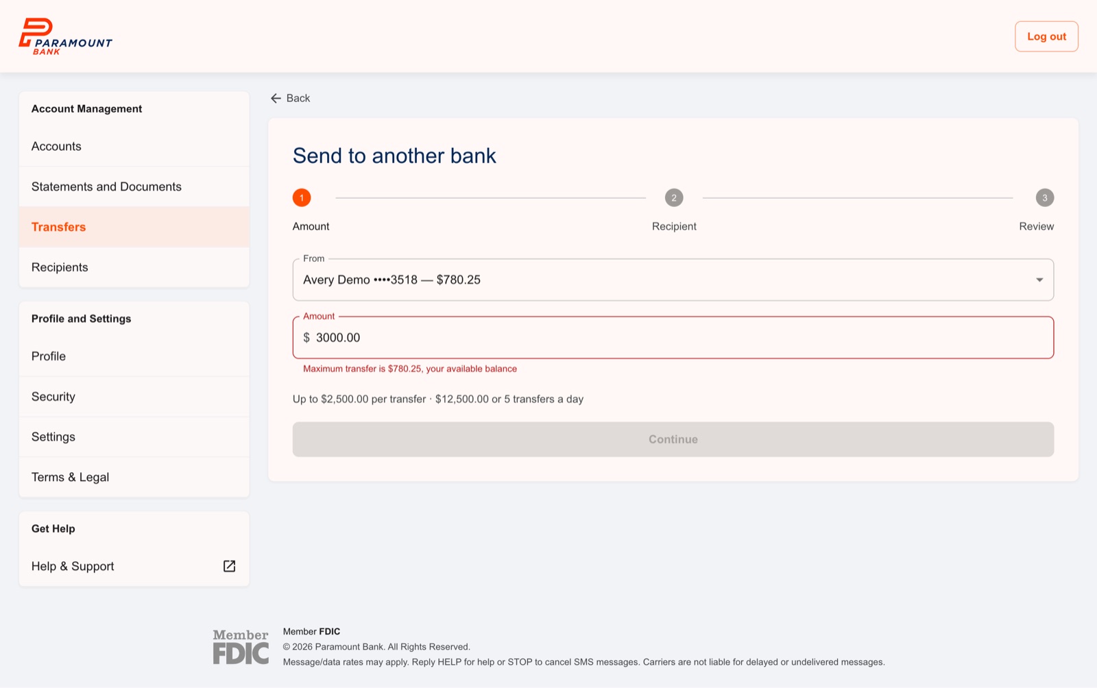
A lot of this project lives in screens most people will never see. I designed the outcomes, limits, and errors alongside the main flows so engineering never had to guess what happens when something goes wrong:
- Application declined or sent for review, each with a clear next step
- Forgot password and check your application status
- Wire after the 2 PM ET cutoff
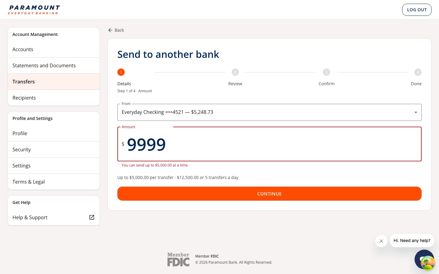
- Amount over your available balance, which tells you the maximum you can send instead of just saying "invalid amount"
- Wrong one-time code
- Page not found
7. Statements, Settings, and Help
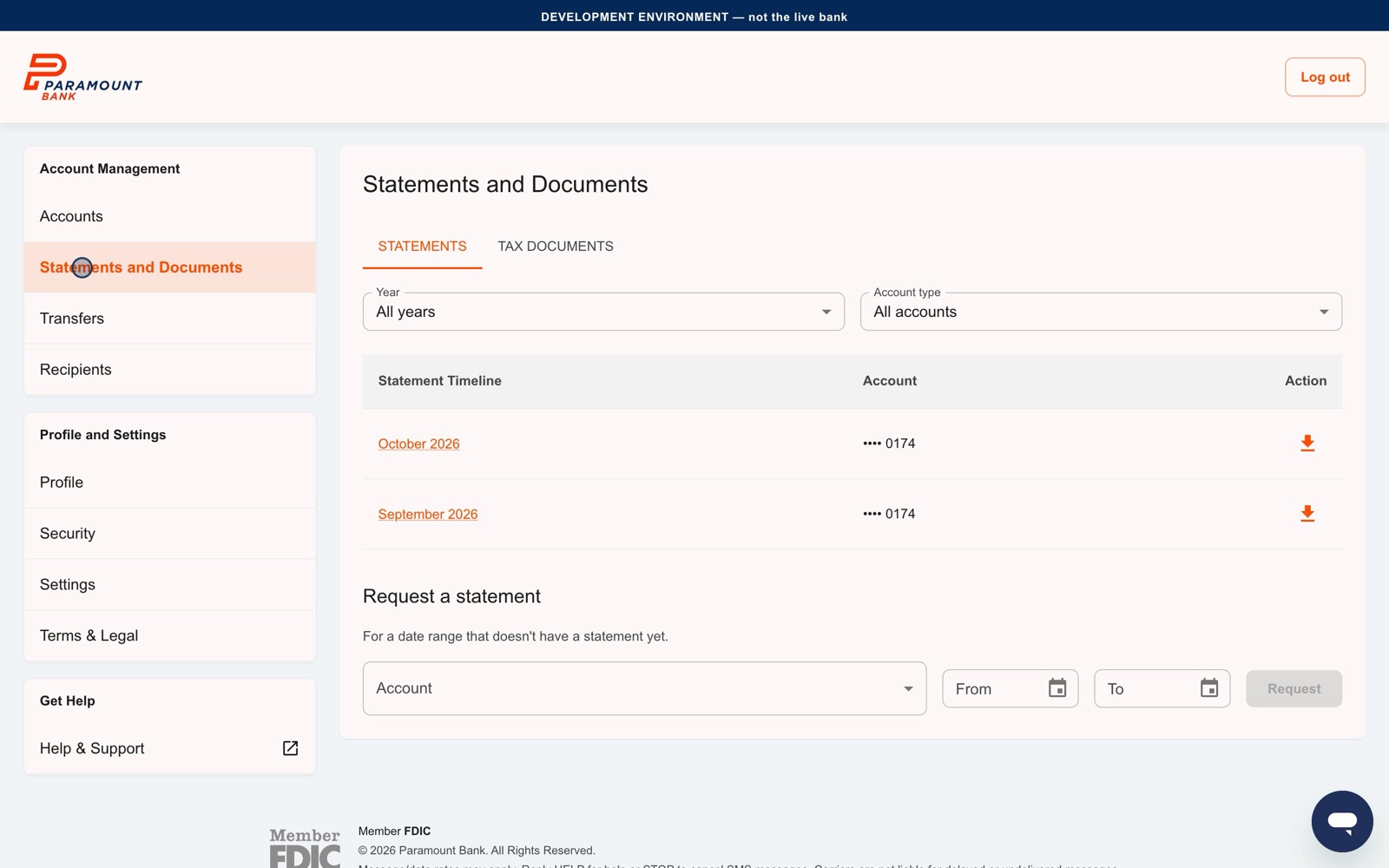
Statements, tax documents, and signed agreements all open in an in-app PDF viewer. Profile, security, and statement and alert settings live in one place. And Parker, our chat assistant, is available from every screen once you're signed in.
8. From Figma to Jira: Executing Inside Our CTO's Roadmap
Our CTO, Jim, authored the product and engineering roadmap for Paramount Every Day Banking and structured the Jira epics across our October 2026 web launch and December 2026 iOS and Android release.
To bridge the gap between design and engineering execution, I took ownership of turning the approved end-to-end flows into buildable work inside Jim's epics:
- Writing & Assigning Jira Tickets: Working directly inside the Jira epics Jim created, I broke down every user flow—personal and business account opening, beneficial ownership certification, two-step verification, ACH and wire transfers, statements, and the unhappy-path error states (
Fig 6.1,Fig 6.2)—into detailed Jira tickets with linked Figma specs, validation rules, and acceptance criteria, and assigned them to developers. - Beginning Development & Executing Tickets: With the tickets scoped and assigned, we are now beginning development and actively executing tickets toward the web launch, followed by the iOS and Android apps built on the same core flows and security rules.
- Designing for Our CTO's Long-Term Roadmap: Jim's roadmap also charts the future evolution of Parker (
Fig 7.2) into a "Trust-First" agentic banking concierge using Model Context Protocol (MCP). Because I designed our MVP confirmation screens (Fig 4.2andFig 5.1) around explicit human-in-the-loop review and one-time verification codes, those exact UI guardrails will serve as the Return of Control checkpoint as the team builds toward future agent-staged workflows.
9. Next Steps: Redesigning the Web Experience (In Progress)
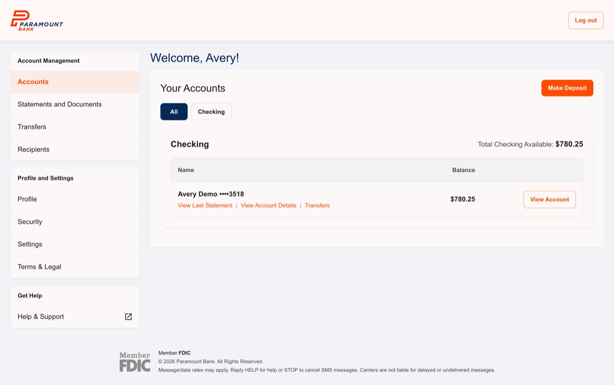
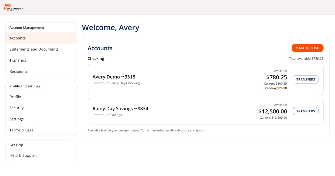
With the MVP flows built, I'm now leading a redesign of the Paramount Every Day Banking web app. Each flow goes through the same four steps: Before → Analysis → Target in Figma → gradual rollout, and every change gets a before-and-after review before it moves forward.
Where it started. I audited the existing web app end to end: 12 flows, 83 steps, and 100 findings, plus a copy audit of roughly 1,000 strings. Every finding is mapped to the Jira epics so the redesign stays inside the roadmap instead of next to it.
What's done so far:
- A Paramount design system in Figma. A published library built on MUI for Figma, themed to the new Every Day Banking brand: logo orange
#FF4D00, navy#042857, a warm grey page ground with white outlined cards, Open Sans, and a Guidelines page covering action hierarchy, voice, and do's and don'ts. - A written design spec (
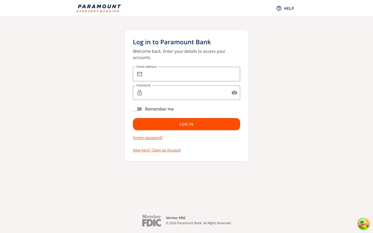
design.md). Tokens plus the reasoning behind them, so engineers and AI coding tools build from the same rules. - Sign-in, verification codes, and password reset, redesigned. These are the first flows rolled out, checked against WCAG 2.2 AA with automated accessibility tests.
The rules I'm designing to:
- One orange action per screen. Everything else is navy outlined or text, so the next step is never ambiguous.
- Nothing that moves money is confirmed blind. Fees, timing, limits, and status are shown before and after, and Pending is never shown as Completed.
- Errors say what to do. "Enter an email address like name@example.com," never "Invalid."
- No fake data. Every balance, status, limit, and fee on screen has to exist in the core ledger (NetXD). If a screen needs something the ledger doesn't return, we log a ticket instead of inventing it.
What's next:
- Accounts and the dashboard. Finalize the redesigned dashboard and account page in Figma (
Fig 9.2), then roll them out. - Sending money by ACH. The redesigned transfer flow (
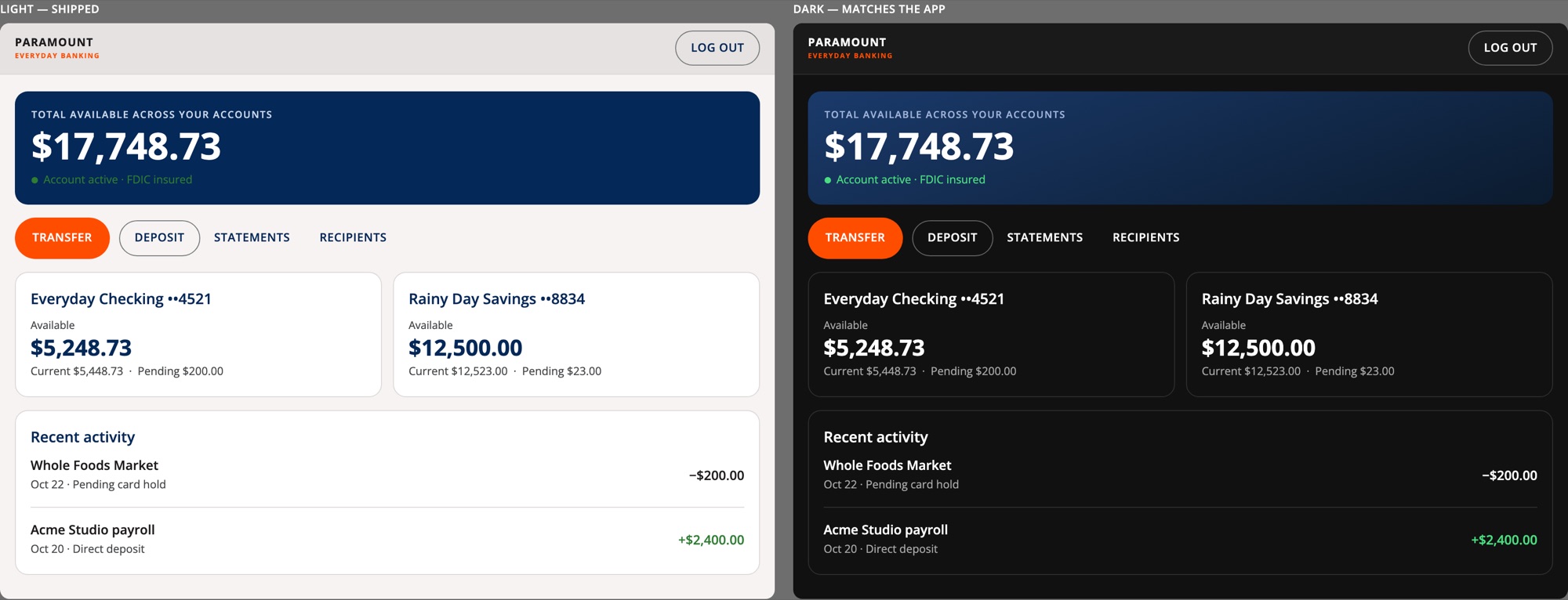
Fig 9.4) is designed and in review, next in line after the dashboard. - A dark theme for web. Paramount's mobile app is dark-only. I'm proposing a web dark theme matched to the shipped app, built on the same tokens as the light theme so the two switch cleanly, with every text pair checked for contrast (
Fig 9.5). - One component gap to close. The library's app bar locks its logo slot, so every screen currently rebuilds its own header. The fix belongs in the design system: an app bar whose logo and right-hand action are real component properties.
All names, accounts, and amounts in these screens are test data.