Multi-Brand Card Design System: Material 3 & MUI Tokens
How we built a shared design system across 4 co-branded Visa and Mastercard programs and 8 Light/Dark themes.
- 4
- Card Programs Unified
- 8
- Light & Dark Themes
- -60%
- App Implementation Time
1. Turning Complex Requirements into a Shared Language
When we began launching multiple co-branded credit card and banking programs at Jassby—starting with the SIG Sauer VISA card and expanding to the Freely Commercial Mastercard, Paramount Bank, and our white-label consumer rewards card—designing and coding each mobile app and web portal from scratch quickly became our biggest bottleneck. Every time a color value or spacing rule drifted out of sync between Figma and our production branches, designers and engineers spent days going back and forth over small visual details instead of focusing on the customer experience.
To bring our designers, engineers, and partners onto the same page, I leveraged Figma's Material Theme plugin and Google's Material 3 (M3) library paired with Material UI (MUI) to build and document a shared design system across our mobile apps and web applications. Most importantly, building that well-documented system alongside interactive prototypes turned complex product and compliance requirements into a shared language—allowing us to launch new partner brands across 8 Light and Dark themes while cutting UI and engineering build time by 60% (from 3–4 weeks of custom styling down to under a week).
2. What Made This Tricky
Building a white-label design system for credit cards meant solving three practical problems:
- Completely different brand personalities: A tactical outdoor brand (
SIG Sauer—matte black, steel gray, high-contrast amber gold) looks nothing like a modern corporate spend card (Freely—deep violet and soft lavender) or a consumer cashback app (Vibrant Teal & Emerald). - Strict card-processor SDK limits: Our mobile apps sit on top of payment processor SDKs that handle sensitive card numbers, PIN changes, and Apple/Google Wallet provisioning. Those SDKs only accept specific token slots rather than freeform custom CSS.
- Keeping contrast accessible in both Light and Dark modes: A button or warning banner that passes WCAG AA contrast in one brand's Light mode can easily become unreadable when swapped into another partner's Dark mode palette.
Our Rule of Thumb
"One component tree, zero hardcoded hex values. Every background, text style, border, and button state pulls from semantic Material 3 color roles (
primary,onPrimary,surfaceContainer,outlineVariant) that we check for contrast in both Light and Dark modes."
3. Material 3 Color Roles & Token Mapping
For each partner program, I built a complete Material 3 tonal palette and role mapping in Figma and handed off clean token specs for iOS, Android, and Web:
- Surface steps instead of drop shadows (
surface→surfaceContainerHighest): In dark mode, drop shadows get muddy. Using stepped surface tones keeps cards, accordions, and bottom sheets distinct across every brand. - Paired foreground and background tokens (
primary/onPrimary): Every badge, APR callout, and primary button automatically pairs its background token with a contrast-checked text token.

Stacked Card and Horizontal Card components (Filled, Elevated, and Outlined states) across all 4 card themes: SIG Sauer VISA (Dark), Freely Mastercard (Light), One-Eleven Proposal (Dark), and Paramount Bank (Light).

Primary #FCB31C, Surface #171717).

Primary #4727E2, Surface #FCF8F8).

Primary #84D2DC, Surface #0E1415).

Primary #FF5400, Surface #FFF8F6).


4. White-Label Mobile Credit App (Light & Dark Modes)
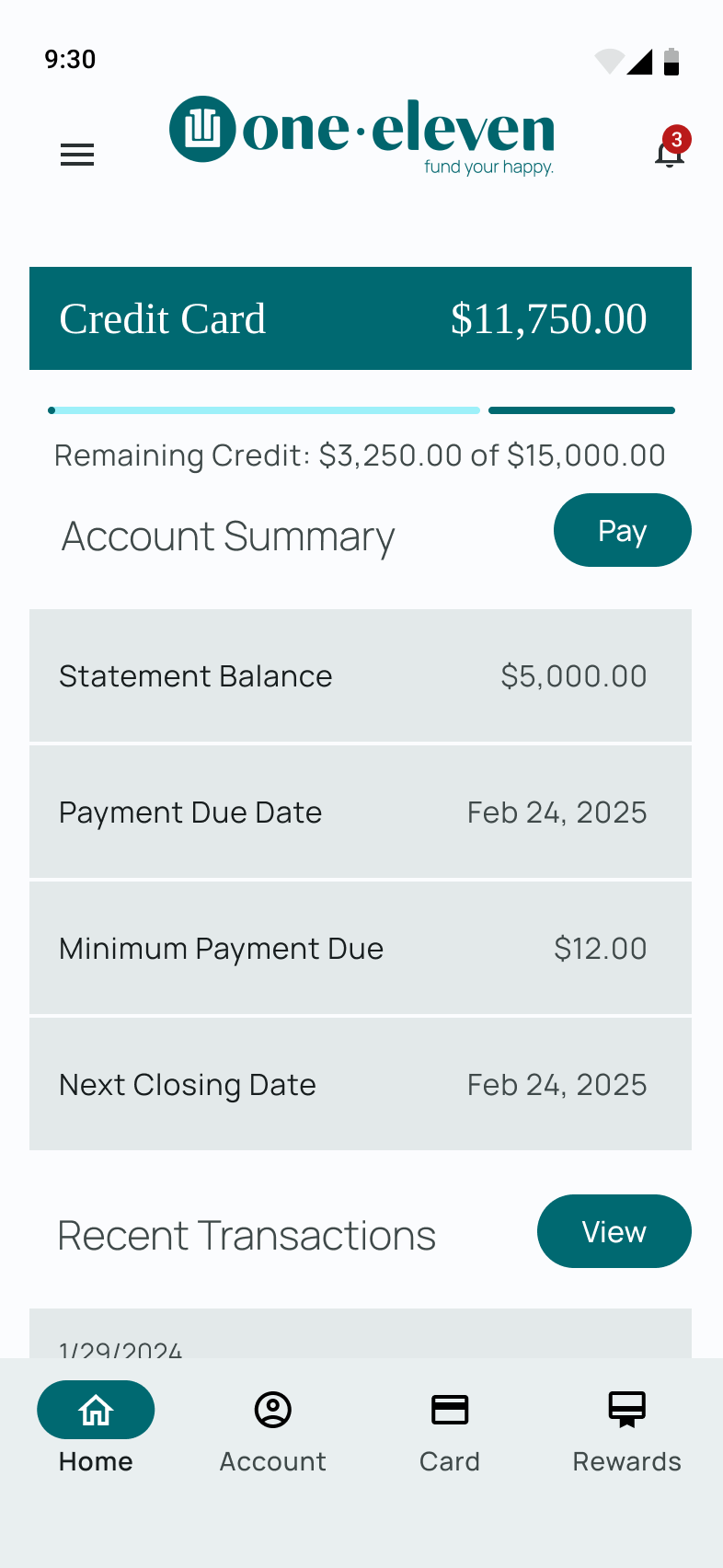
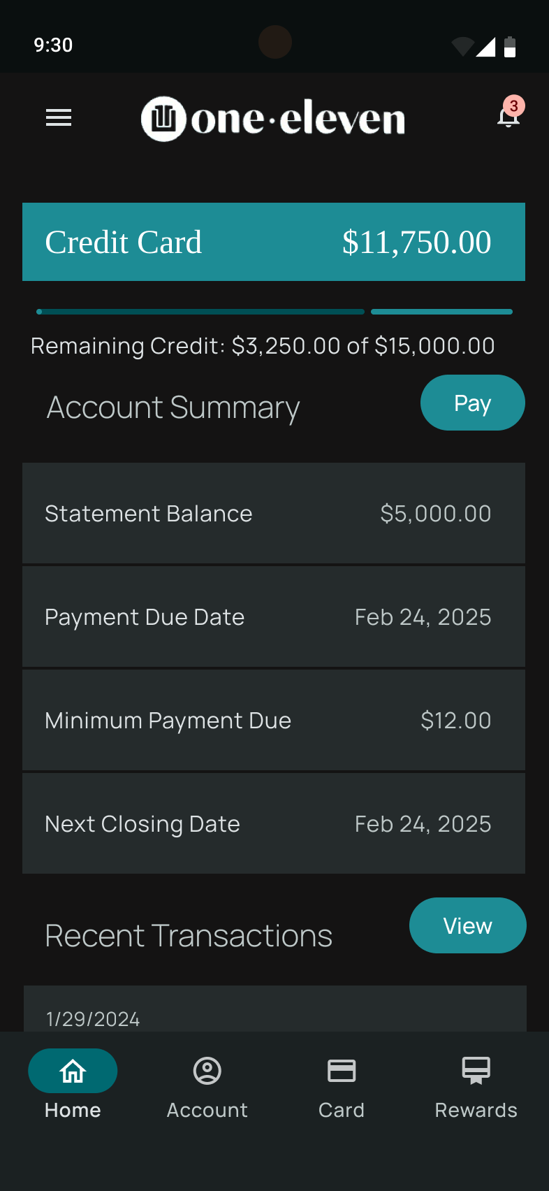
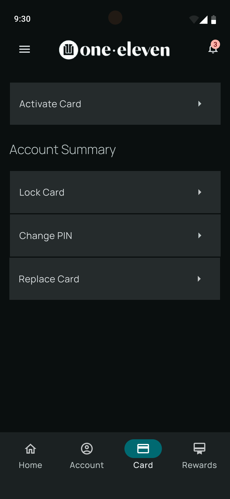
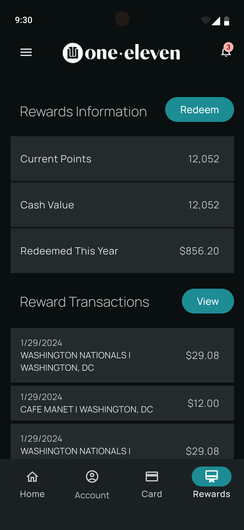
So prospective partners could preview their mobile app in days instead of weeks, I designed our White-Label Mobile Credit App template with instant switching between Light Mode and Dark Mode:
- Home & Spend Overview: Current balance, available credit bar, payment due dates, and transaction feed.
- Card Controls: Virtual card preview, one-tap
Lock Card, Apple/Google Wallet setup, and monthly statements. - Rewards Tab: Flexible rewards layout that works for both points multipliers (
5× Points) and simple cashback (2% Unlimited).
5. Web Component Library (MUI v6.1.0)
On the web, we carried the same token setup into MUI v6.1.0 to power our credit card applications, partner landing pages, and digital banking platform:
- Shared Component Library (
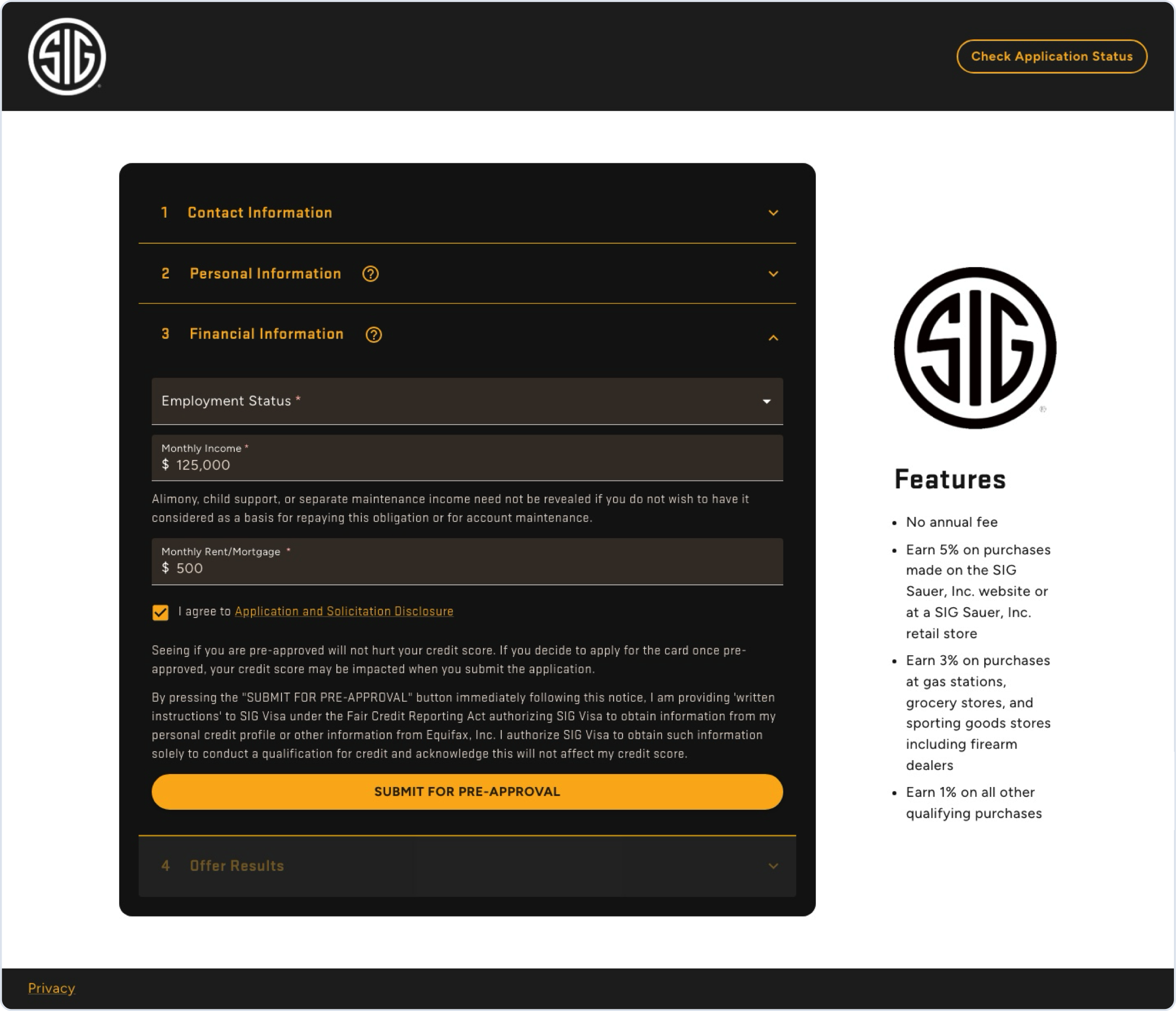
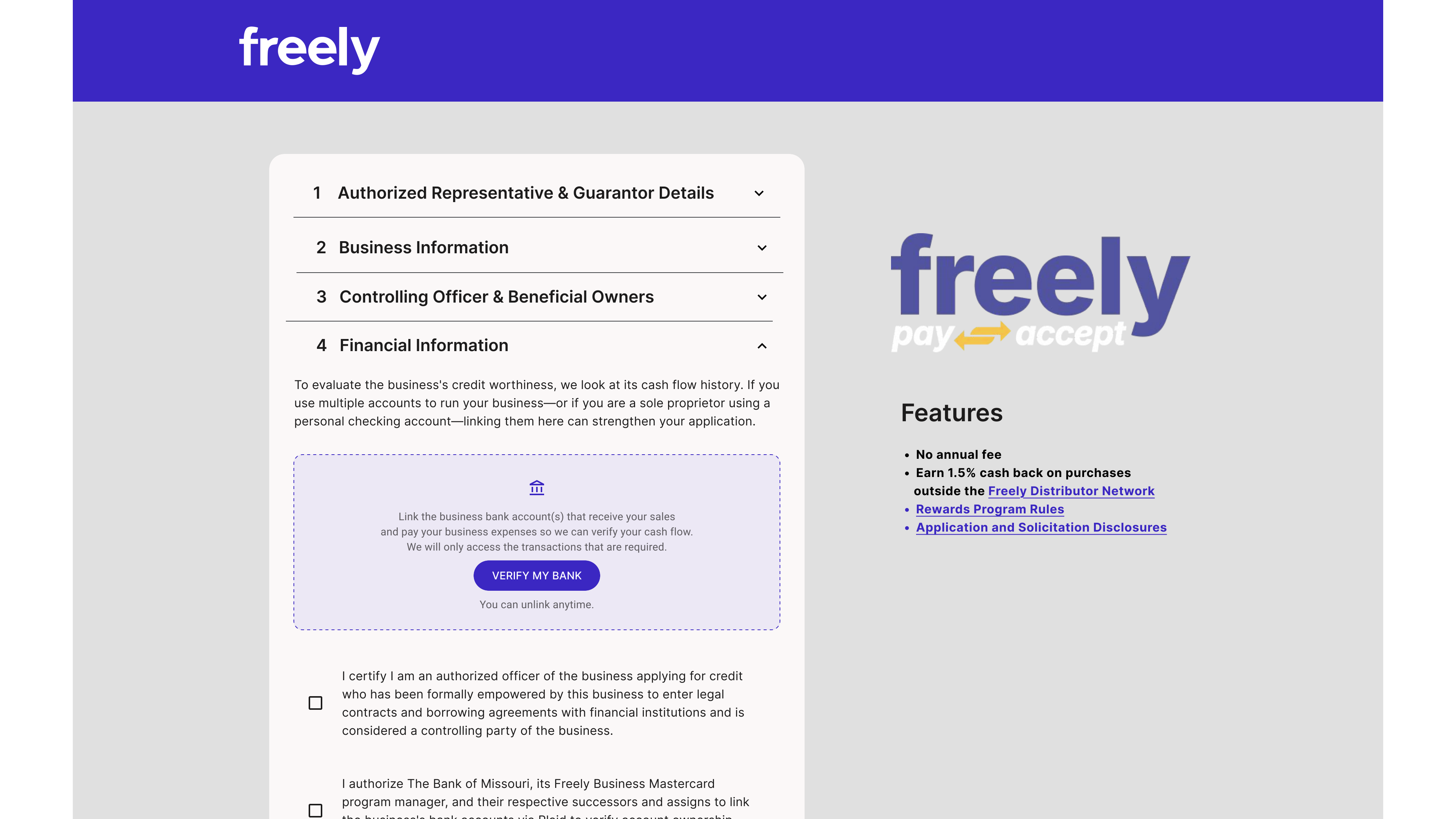
Inputs, Data Display, Feedback, Surfaces, Navigation, Layout): Standardized text fields, masked currency and SSN inputs, date pickers, alerts, and steppers across all web flows. - One Accordion Pattern for Consumer & Commercial Cards: Both our Consumer VISA application and our Commercial Mastercard application use the exact same accordion container, progress stepper, error banner, and legal disclosure modal components.
- Fast Partner Theming: Swapping a single theme file turns a dark tactical consumer application into a clean commercial banking flow.

6. What Changed for Our Team
| Area | Before Shared Tokens | With Our M3 + MUI System |
|---|---|---|
| Mobile App Implementation | 3–4 weeks of custom styling per partner | Cut time to implementation by 60% (< 1 week) |
| Programs & Accessibility | 1 single-brand app with manual contrast checks | 4 card programs · 8 Light/Dark themes with strict WCAG contrast |
| Compliance Reviews | Re-reviewing every screen from scratch | Pre-approved legal modal & disclosure components |
| Web & Mobile Handoff | Separate specs for iOS, Android, and Web | Shared M3 (Mobile) + MUI v6 (Web) token structure |