Jassby Travel & Schools: B2B Partner Admin & AI-Assisted Redesign Proposal
Shipping high-volume card lot & allotment workflows (~100% YoY program growth) and authoring an AI-assisted, React-audited 11-flow overhaul proposal.
- ~100% YoY
- Cards, Transactions & Spend Growth
- 6 Shipped
- Production B2B Jira Workflows
- 11 Flows
- AI-Assisted React Overhaul Proposal
1. Making High-Volume Travel Card Operations Feel Calm
When a student travel coordinator is preparing hundreds of physical and virtual Visa or Mastercard stipends before a Friday departure, the last thing they need is a dashboard that slows them down. Jassby's Travel & Schools (Trip Card) portal powers group travel programs for partners like WorldStrides and Scholastica Travel—where operations teams order bulk card lots, split shrink-wrapped card batches across regional warehouses, assign cards to trips, and schedule automated meal and activity stipends.
As the program doubled year over year (~100% YoY growth in cards issued, transactions processed, and spending), those everyday workflows began showing strain: years of expired card lots slowed down table loads, trip assignment dropdowns grew unwieldy, and a single formatting mistake in a bulk CSV upload could block an entire roster without explaining which row failed.
Working closely with our CTO, web and backend engineers, and partner operations leads, I tackled the portal across two tracks:
- Unblocking Enterprise Operations in Production: Designing and shipping six targeted dashboard upgrades—from lifecycle tabs and PRN-based card lot splitting to row-level CSV validation—that immediately removed daily friction for our travel partners.
- Auditing the React Codebase, Prototyping a Full Overhaul & Validating via Directed Client Interviews: Using Claude Code and interactive React/HTML/CSS prototyping to inspect our production React components (
FundingAccount.jsx,Inventory.jsx,Tour.jsx,Allotments.jsx,Activities.jsx), design a gradual, zero-disruption overhaul with aClassic viewtoggle, and lead directed client interviews to validate the new features with travel clients before pushing any changes to production (PROD).
2. Shipped Production Features: Unblocking Enterprise Operations
Working directly from partner feedback (WorldStrides Admin, Scholastica Travel) and internal support tickets, I designed and shipped six targeted B2B dashboard and internal tooling upgrades:
2.1 Three-Tab Order Lifecycle Table (Assigned, Inventory, Closed)
Previously, every card lot a partner had ever ordered rendered in a single table—slowing down load times and cluttering active operations with expired cards. I split Trip Card Orders into three lifecycle tabs (Assigned Trip Lots, Inventory Trip Lots, and Closed Trip Lots) with contextual action toolbars and a state-protection confirmation modal when switching tabs with active row selections.
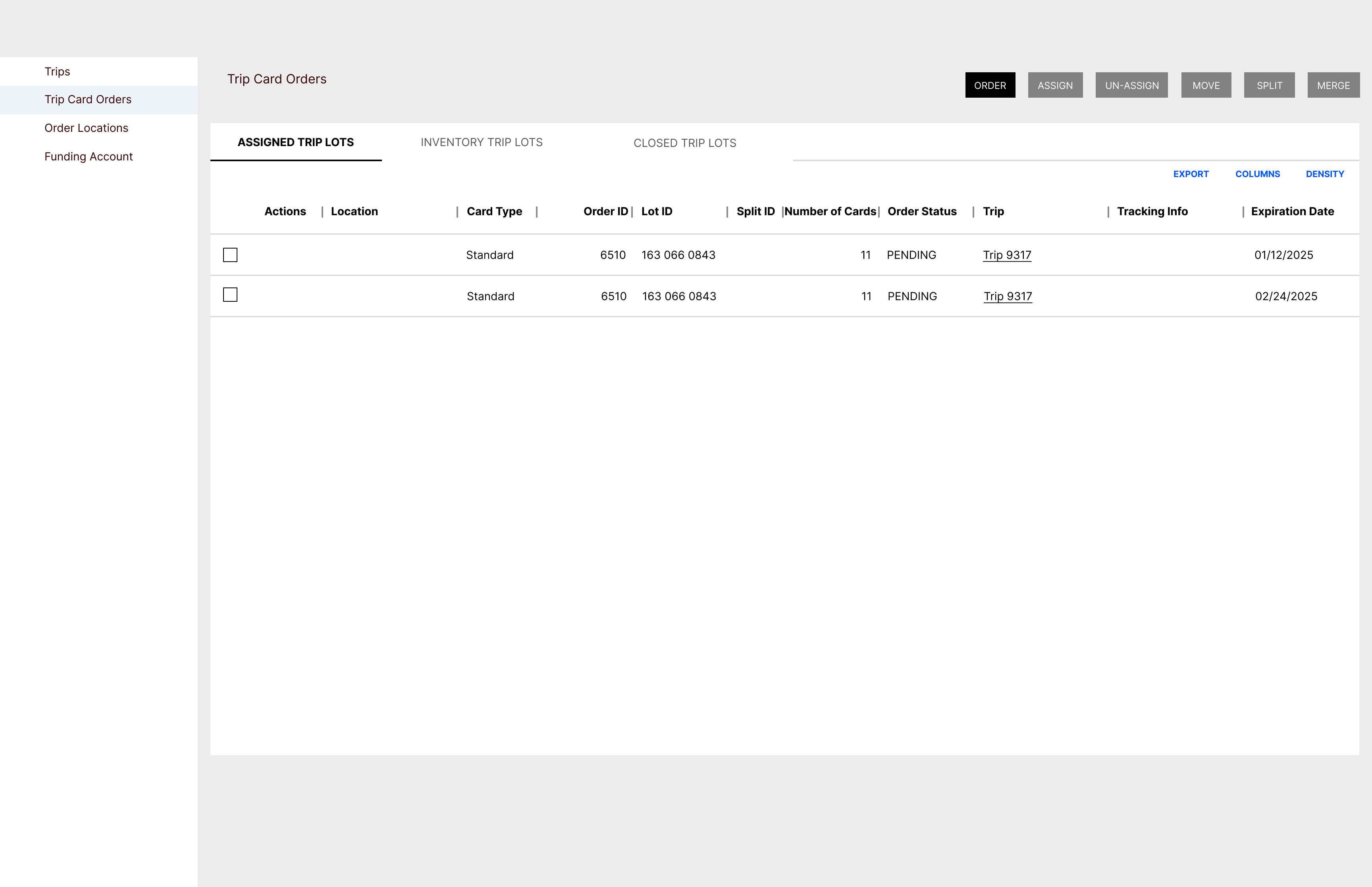
Assigned Trip Lots, Inventory Trip Lots, Closed Trip Lots) isolating expired card lots to speed up table rendering.
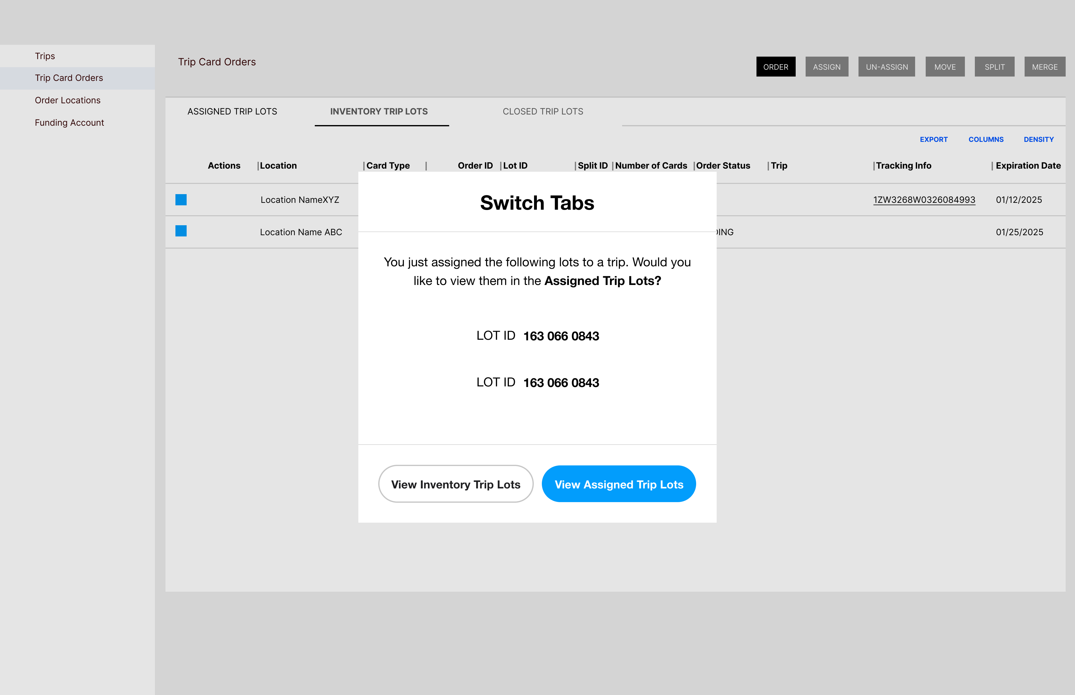
2.2 Standard vs. Advanced Card Lot Splitting (by Last 4 & PRN)
Enterprise partners frequently order bulk inventory lots of 50–100+ physical cards to headquarters and split them across smaller school trips. When physical cards are already shrink-wrapped in batches, operators need to split a lot by exact starting card (Last 4 Digits) and PRN (Payment Reference Number) rather than an arbitrary card count. I designed a dual-mode Manage Card Lot modal supporting both Standard Split (by card quantity) and Advanced Split (selecting exact starting cards by Last 4 and PRN across up to 11+ subgroups).
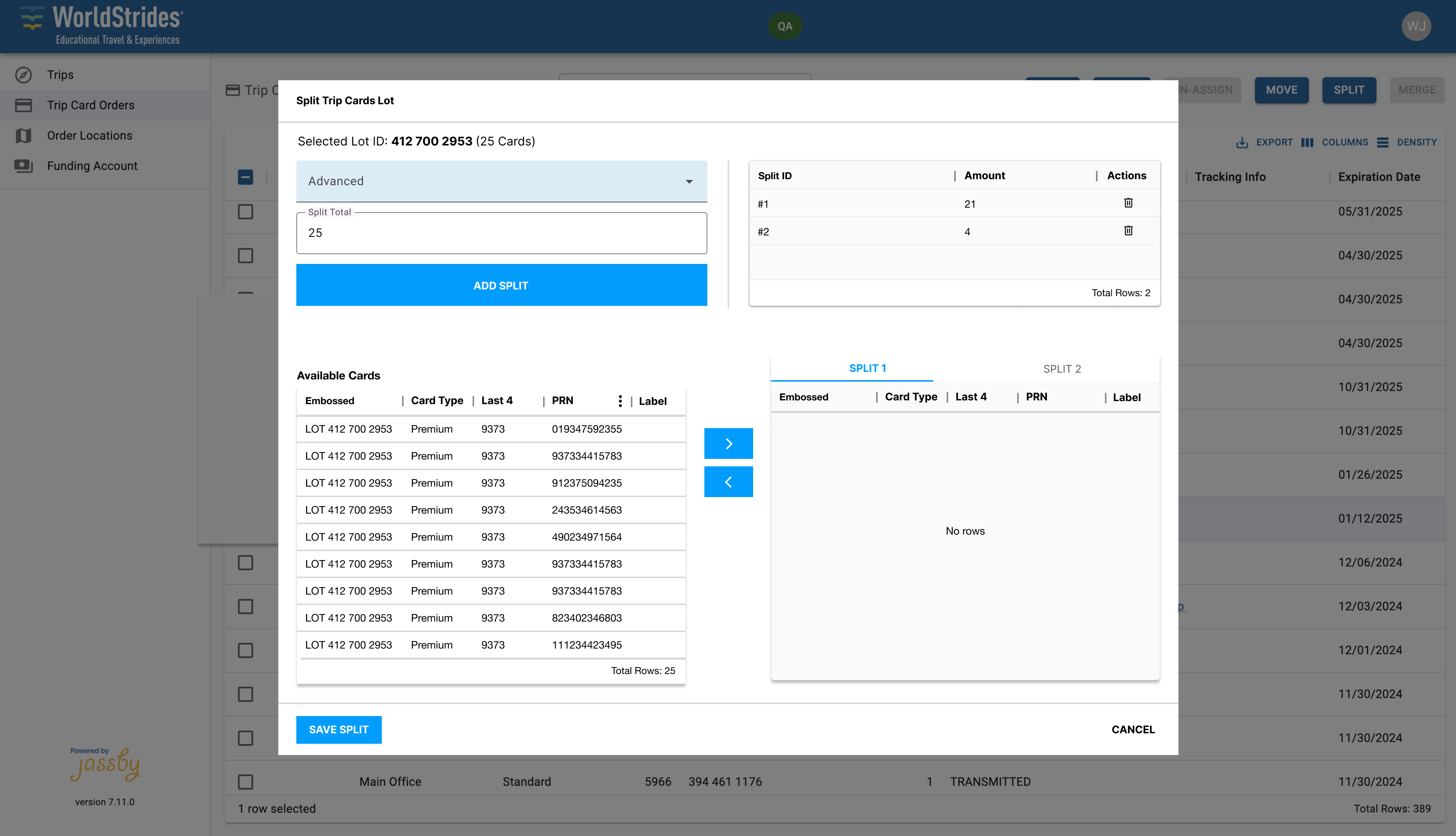
Advanced Split modal allowing warehouse ops to split physical card lots by exact starting card (Last 4 + PRN) across 11+ subgroups.
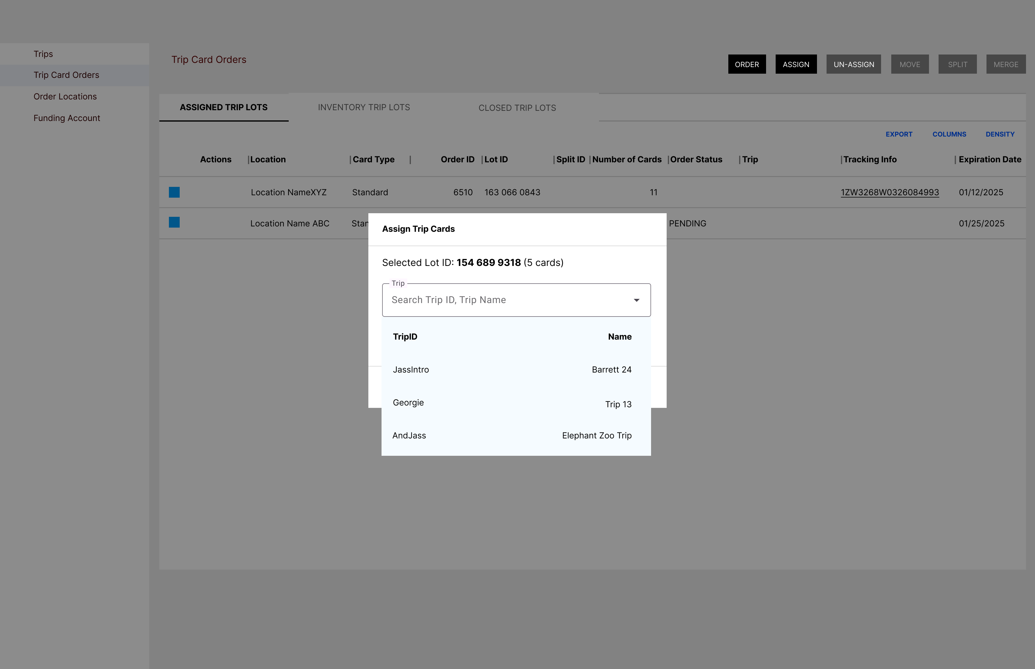
Trip ID | Trip Name typeahead search and sorted dropdown in Assign Trip Cards, resolving WorldStrides' unindexed dropdown bottleneck.
2.3 Bulk CSV Cardholder Label Validation & 5-State Card Controls
When tour leaders assign physical cards to students and chaperones via CSV upload, a single invalid character or mismatched PRN previously caused silent or generic upload failures. I designed inline row-level CSV validation feedback (Row 1: PRN is Invalid, Row 1: Label fields cannot contain symbols) alongside a 5-state card lifecycle status selector (LIVE, LIVE_NO_ALLOT to skip future stipends without deactivating the card, SPARE, LOST, and CLOSED to immediately sweep remaining funds back to the partner's Funding Account).
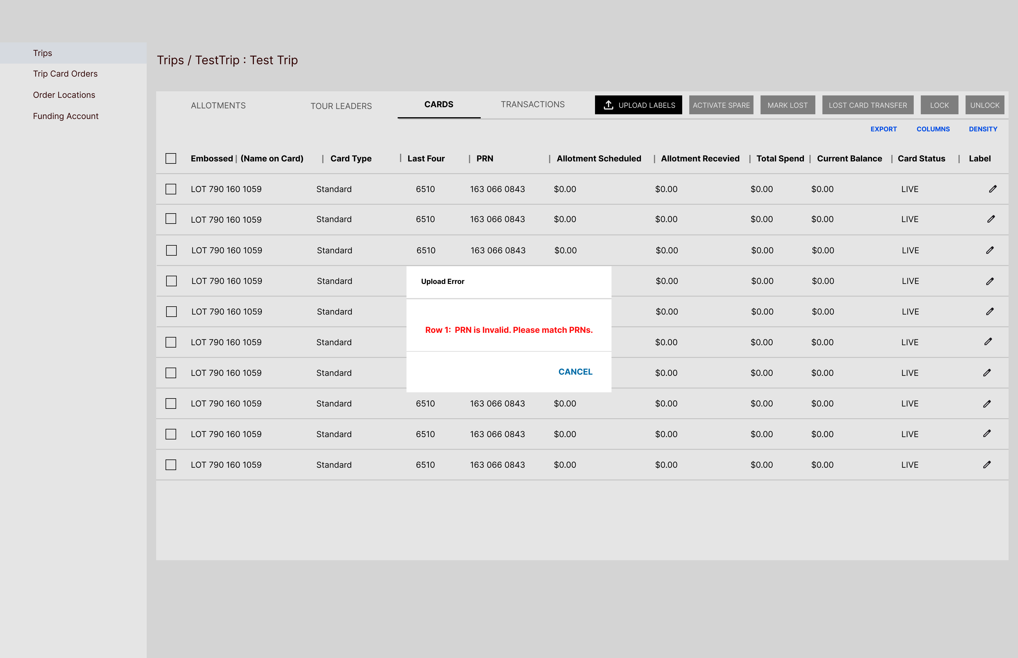
Row 1: PRN is Invalid, Label fields cannot contain symbols).
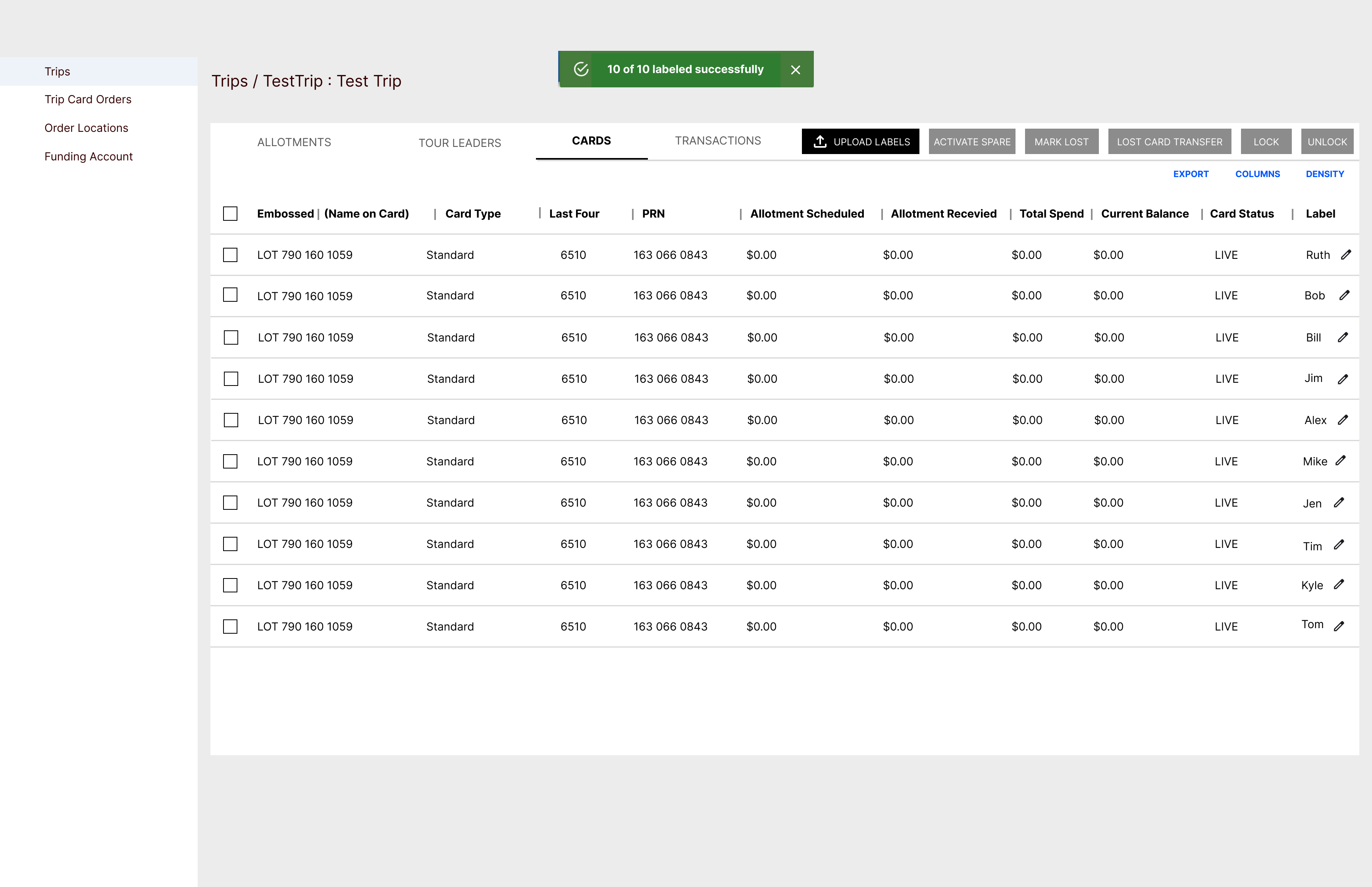
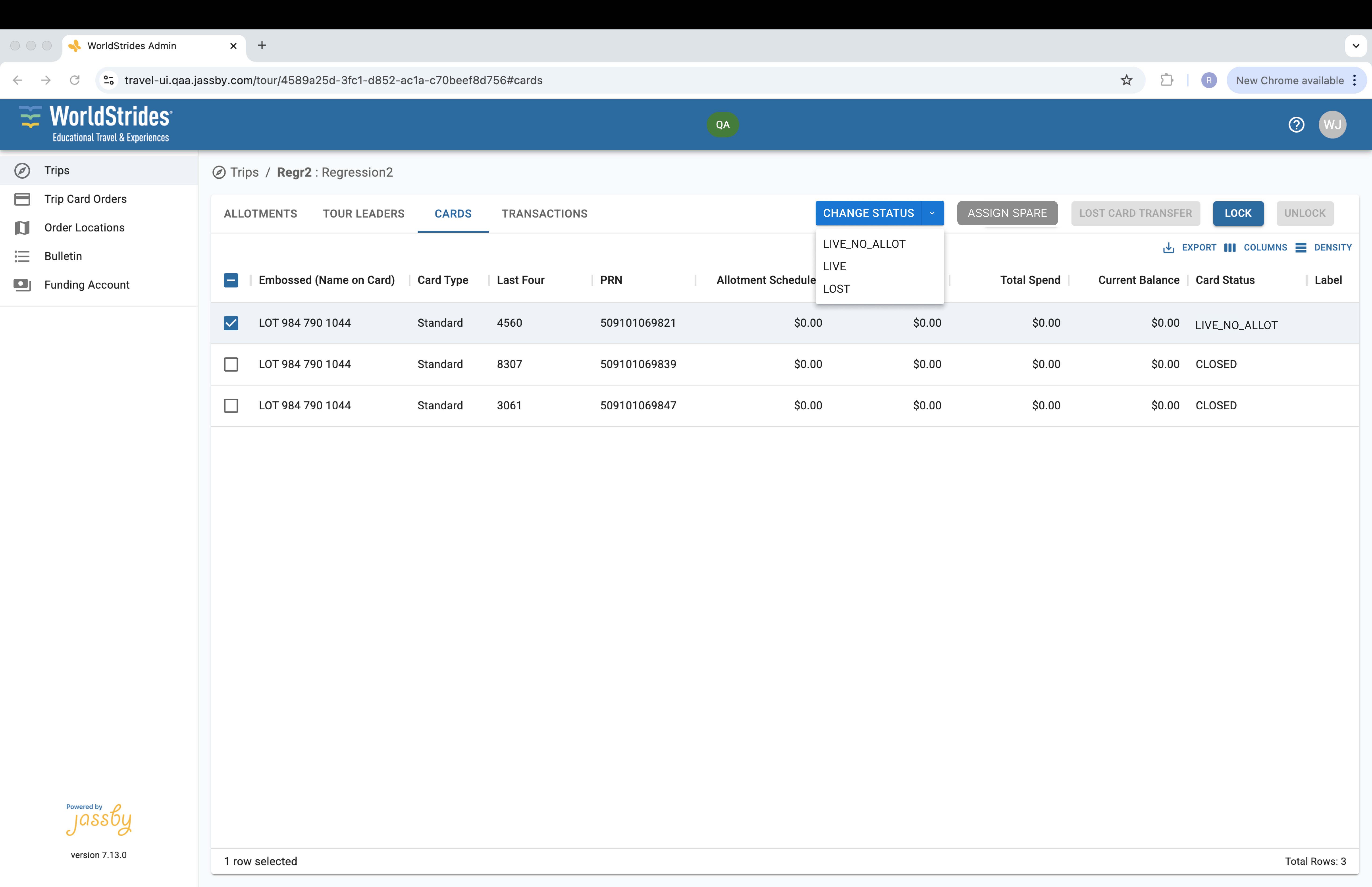
LIVE, LIVE_NO_ALLOT, SPARE, LOST, CLOSED).
2.4 Internal Support Portal (Django Admin) & Partner Bulletin CMS
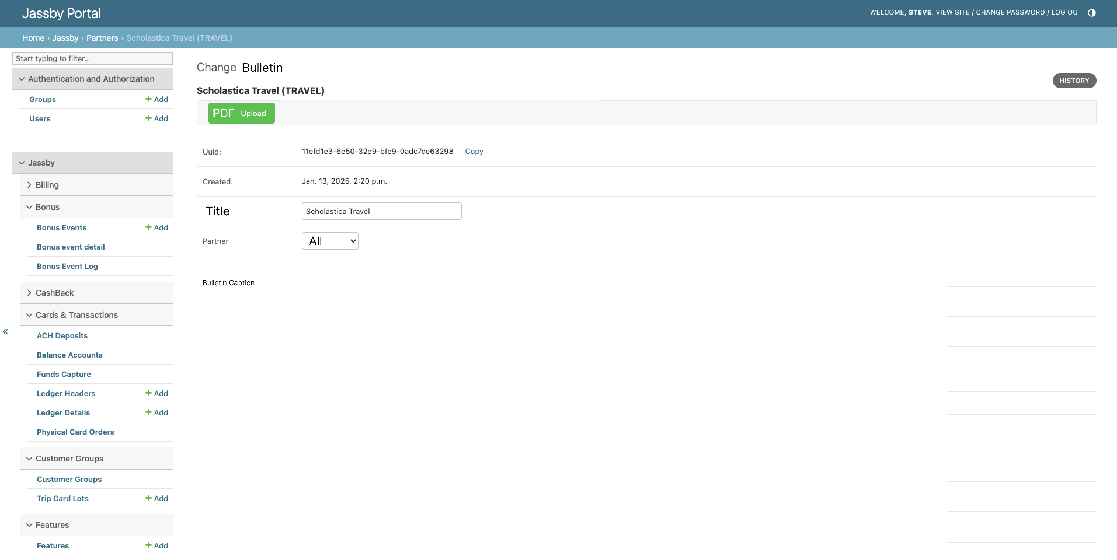
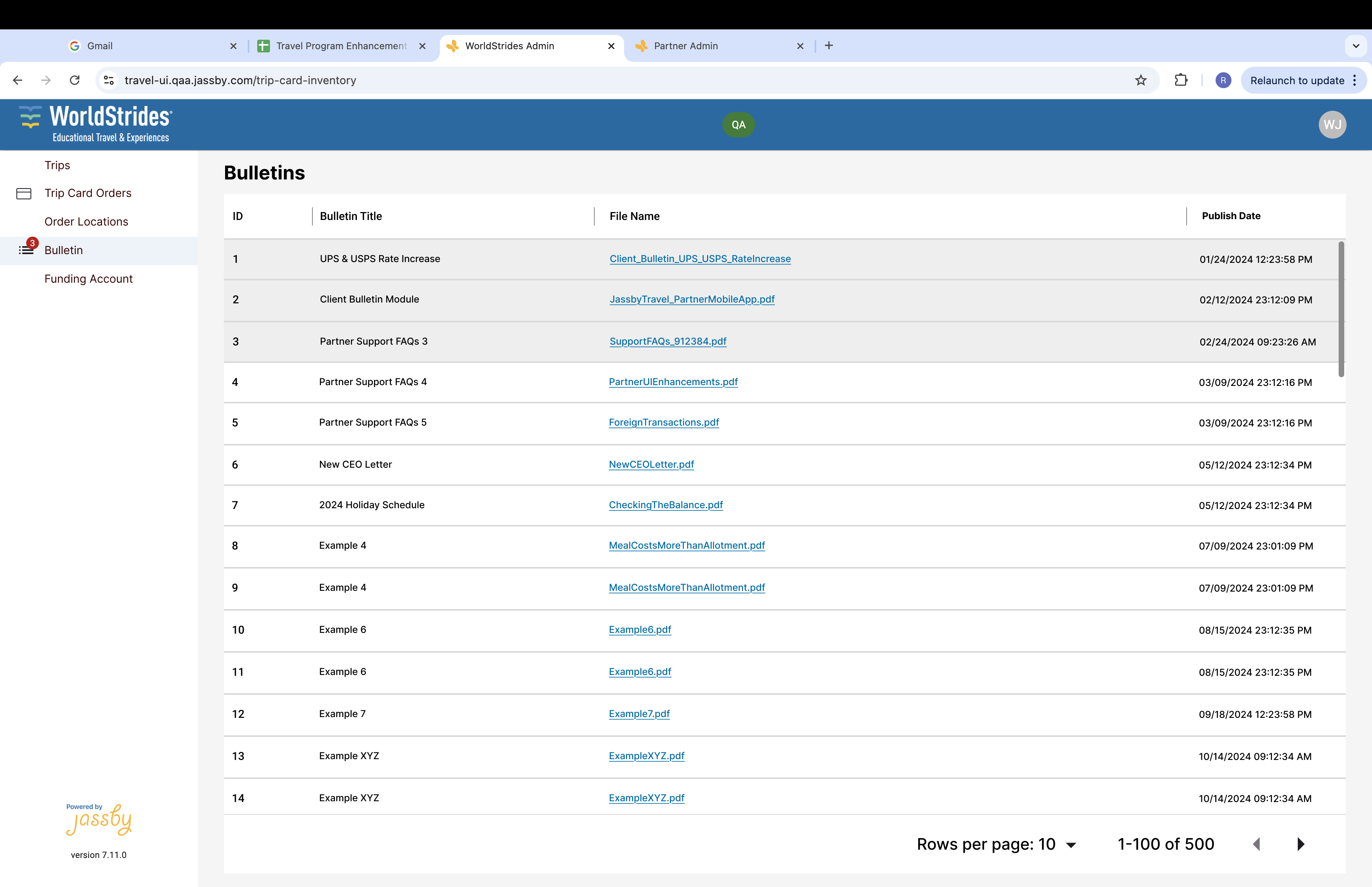
Modeled after Arroweye's production bulletin workflow, I designed both sides of our Partner Bulletin system: the internal Jassby Support Portal (Django Admin) where staff upload PDF operational notices and target specific partner organizations, and the client-facing Bulletin dashboard with unread notification badges and an embedded PDF reader.
3. AI-Assisted Full-Portal Redesign Proposal (Claude CLI Design Mode + React Code Audit)
While shipping incremental fixes kept our fastest-growing partners moving, the underlying portal still carried early architectural debt: raw uppercase system codes (LIVE_NO_ALLOT), hover-only row actions, wide data grids that forced horizontal scrolling, no early warning when scheduled trip allotments exceeded a partner's available funding balance, and desktop tables squeezed onto 511px mobile viewports for tour leaders on the road.
To propose a cohesive long-term vision without pulling engineers off immediate roadmap work—and while reusing our existing MUI (Material UI) primitives—I used Claude CLI in Design mode to audit the actual production React components (FundingAccount.jsx, Summary.jsx, Details.jsx, Inventory.jsx, ManageLotButton.jsx, AssignCardsButton.jsx, Tour.jsx, Allotments.jsx, Activities.jsx) alongside 70+ DEV screenshots, generating an interactive HTML/CSS design artifact covering all 11 partner flows across desktop and mobile that I could iterate on directly from the terminal.
Internal Engineering & Design Workflow Note
“If there is no mockup, can you run this through Claude Design or at least a designer/UX agent to reuse the same MUI elements but deliver a robust and easy-to-use UI?
Claude tip: Turns out you can ask Claude inside CLI to call Design mode and provide you with a decent UI mockup. A prompt piece like this gave me an artifact I could iterate right from CLI…”
Four Guiding Principles of the Proposal
- Answers first: Every screen leads with its core operational question—what needs attention today, how many cards a trip still needs, and whether the funding account will run short.
- Nothing hidden: No hover-only row icons, secret double-clicks on "Posted" rows to unlock a disabled tab, or permanently greyed-out action bars.
- Plain language: System status codes (
LIVE_NO_ALLOT,INVENTORY) become clear human labels with inline explanations. - Gradual by design (
P1–P4Rollout +Classic view): Every flow is scoped into four incremental engineering releases (P1: Polish in place,P2: Context & control,P3: Richer rows & side panels,P4: Theme v2 + Mobile) with a persistentClassic viewescape hatch so enterprise partners never experience a disruptive overnight redesign.
3.1 Funding Account Proposal: Answering "Will We Run Out of Money, and When?"
In our audit of FundingAccount.jsx, Summary.jsx, and Details.jsx, we documented 10 code and UX friction points: only the current balance was shown at the top with no total of scheduled allotments, yellow/red row backgrounds (getRowClass in theme.js) had no legend, and the DETAILS tab was disabled until a user knew to click a POSTED or PAID row.
In the proposed overhaul, the Funding Account header introduces a 3-card Cash-Shortfall Forecast (Current balance $10,525.32, Scheduled allotments -$11,220.00, and Balance after scheduled -$694.68 · Short from Oct 17: fund at least $694.68), flags the exact date and trip where funds run short in the ledger, and replaces the hidden Details tab with a card-level allotment drilldown side panel.
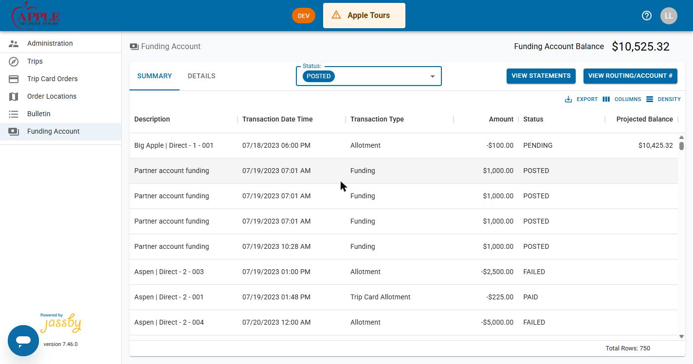
DETAILS tab requires clicking a posted row; no cash-shortfall summary.
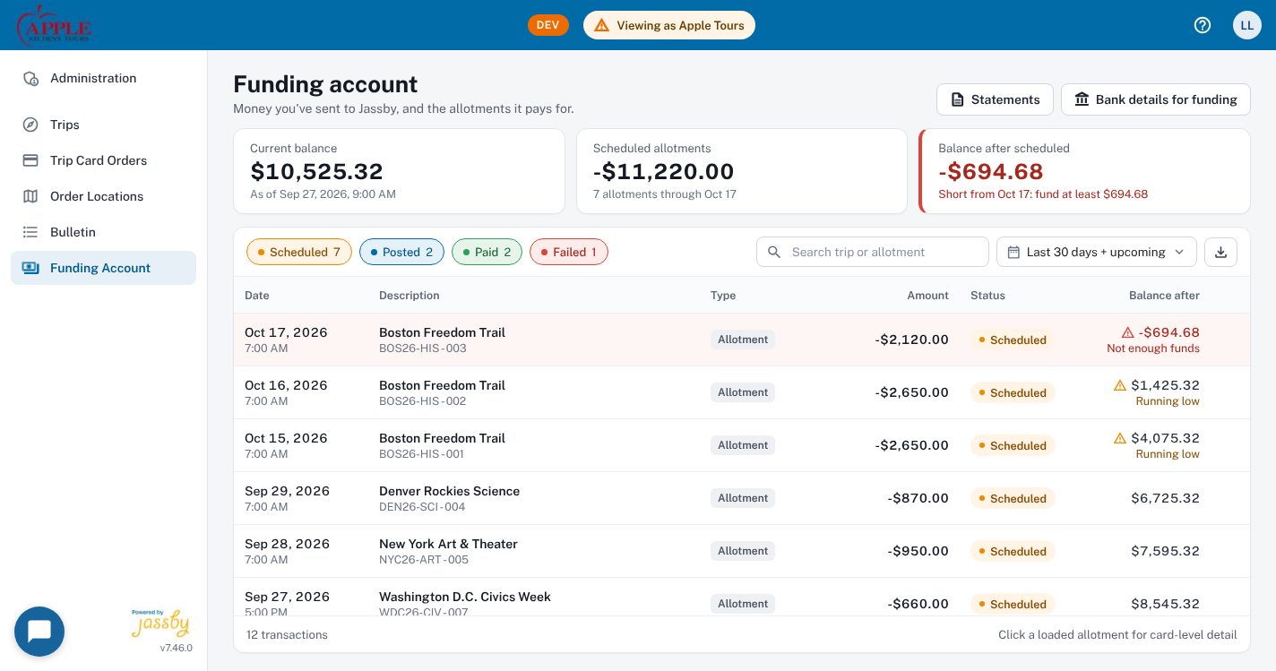
-$694.68), paired with multi-select status chips and inline balance warnings.
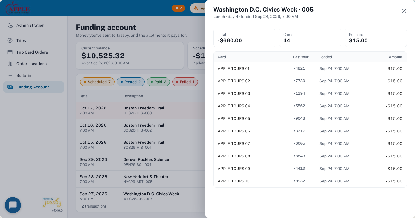
3.2 Trip Card Orders & Assignment Drawer Proposal
Auditing Inventory.jsx, ManageLotButton.jsx, and AssignCardsButton.jsx, the proposal elevates carrier tracking (UPS / FedEx deep links), warehouse location filter chips (All locations 6, Apple Tours HQ 3, Newark Warehouse 3), and 90-day amber card expiration warnings directly into the Trip Card Orders table. Selecting lots reveals a contextual selection bar and opens a side panel (Assign cards to a trip) that ranks upcoming inventory-fulfilled trips by start date and displays live card coverage (Needs 18 more · 0 of 18 assigned vs. Fully covered).
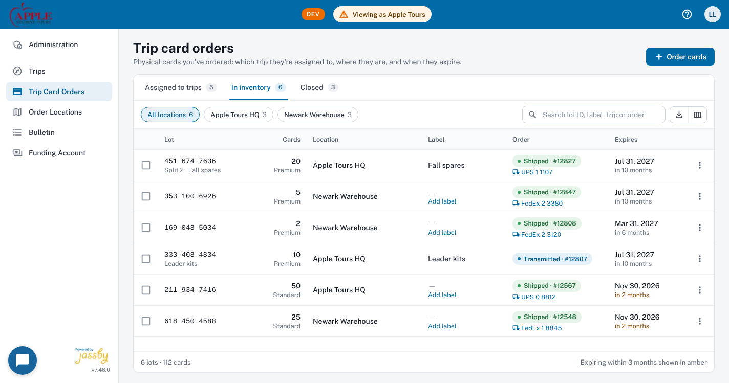
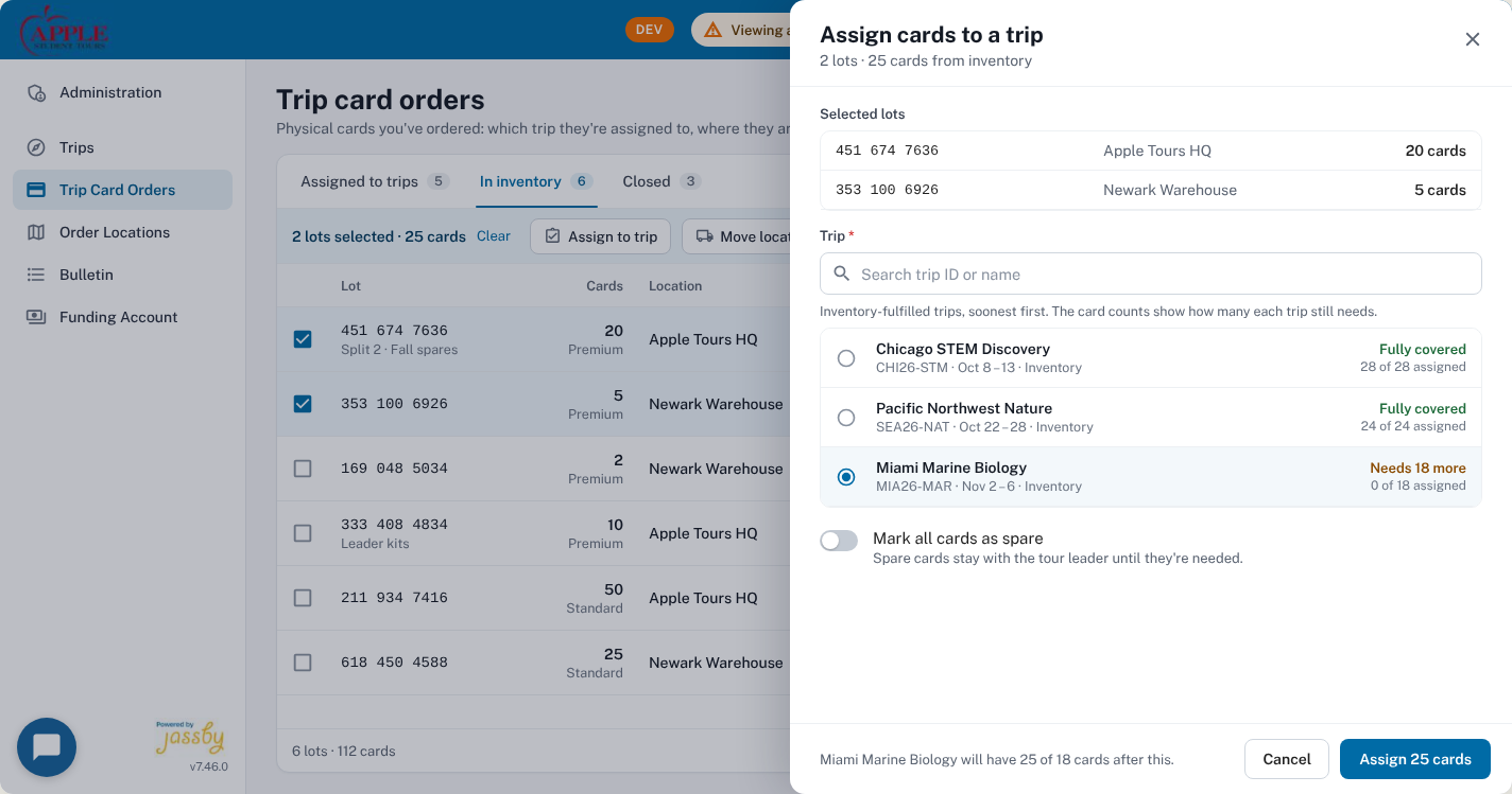
Needs 18 more · 0 of 18 assigned) before confirming assignment.
3.3 Trips List, Trip Detail & Mobile Tour Leader Experience
Auditing Tour.jsx, Allotments.jsx, and AllotmentDialog.jsx, the proposal replaces raw grids with a status-first Trips List (In progress · day 7 of 7, Classic view toggle in the header), a persistent Trip Detail context header across all four tabs (Allotments, Tour leaders, Cards, Transactions), an Add Allotment drawer that previews Allotment total ($1,320.00) against Available funding ($8,420.00) before saving, and a dedicated Mobile layout with bottom navigation, card rows, and 44px+ touch targets for tour leaders in the field.
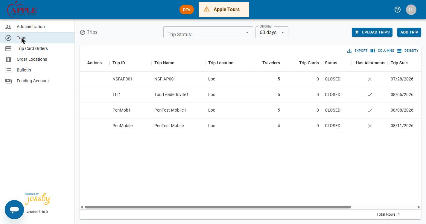
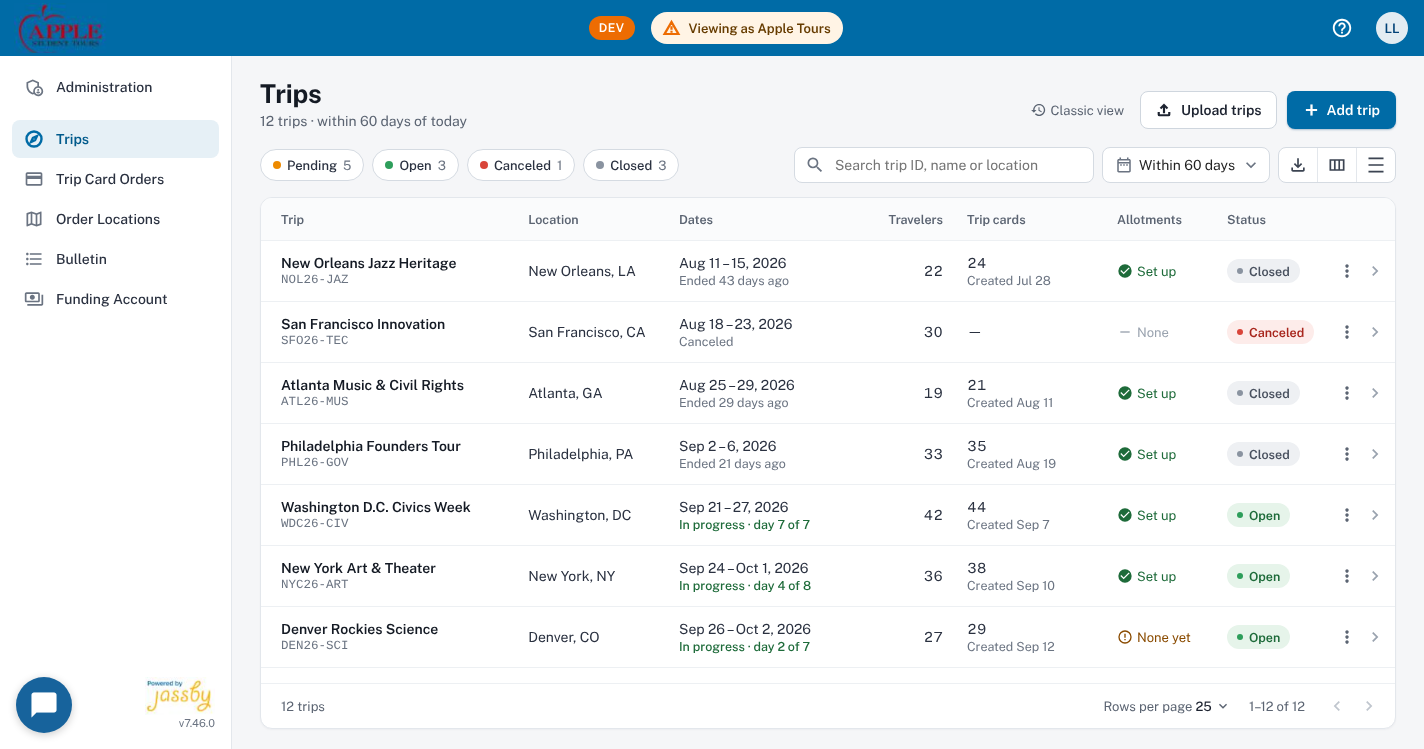
In progress · day 7 of 7), allotment readiness (None yet warning), and a Classic view toggle.
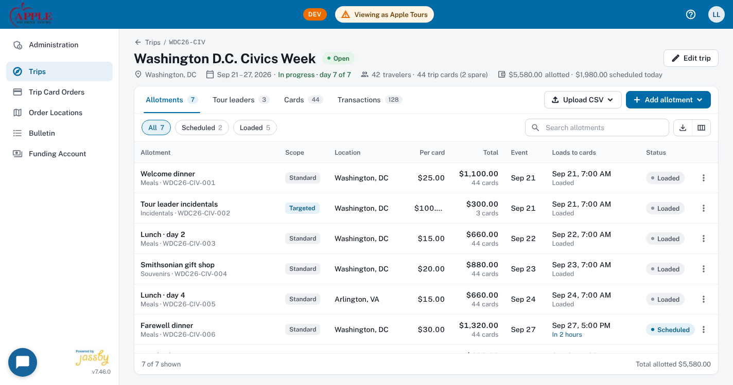
Loaded vs. Scheduled (In 2 hours) allotments.
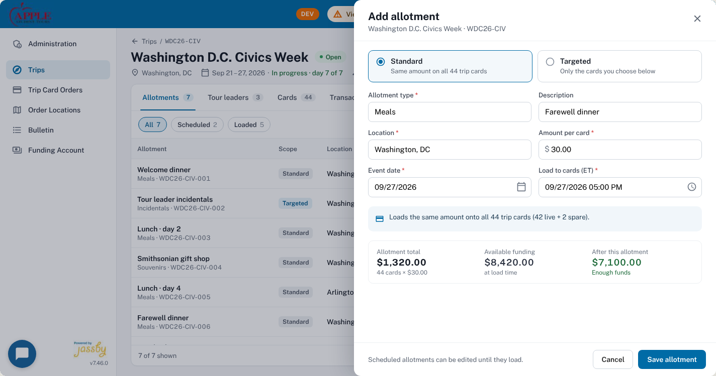
Allotment total ($1,320.00) vs. Available funding ($8,420.00) and remaining balance ($7,100.00 · Enough funds) before saving.
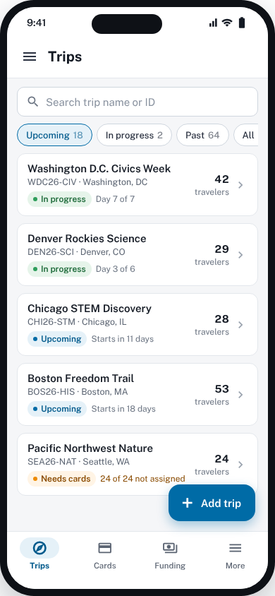
Trips, Cards, Funding, More) and card-based rows.
Progressive Delivery Architecture
Why a 4-Phase Rollout Matters for Enterprise B2B
Enterprise travel coordinators use the Partner Admin portal daily during peak student travel seasons. Rather than proposing a risky "big-bang" rewrite, the AI-assisted proposal maps every React component change into four self-contained releases:
- P1 · Polish in place: Readable status labels, visible row actions, and column widths that fit without horizontal scroll—zero layout shifts.
- P2 · Context & control: Shared page headers, cash-shortfall balance forecast cards, status filter chips, and multi-row selection bars.
- P3 · Richer rows & panels: Relative trip timing, inline carrier tracking links, and non-destructive right-hand side panels replacing modal dialogs.
- P4 · Theme v2 + Mobile: Public Sans typography, refined surface hierarchy, and dedicated mobile card & bottom-sheet layouts for tour leaders.
4. Physical Card Art & Print Marketing: Jassby Travel Banner Poster (SYTA)
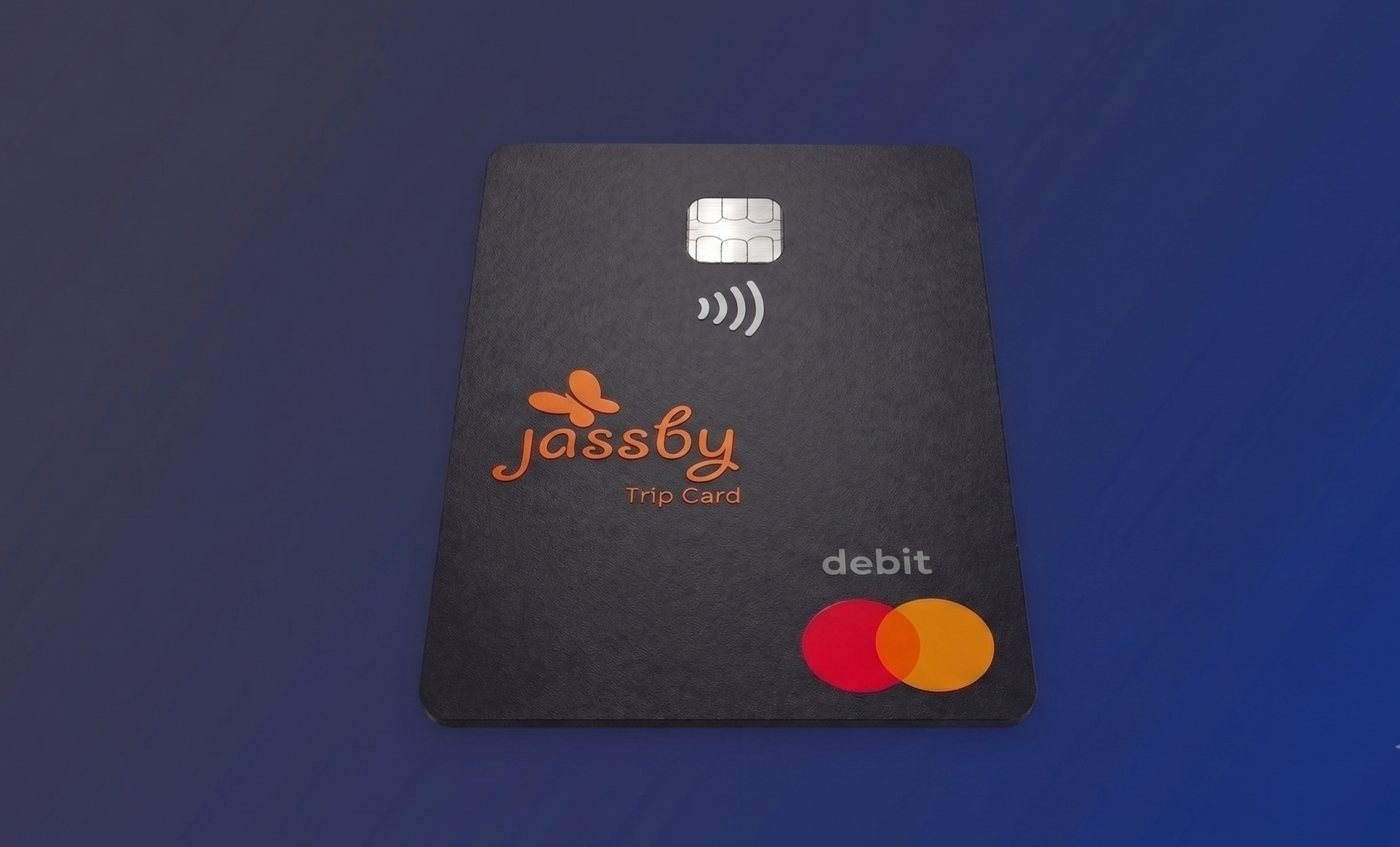
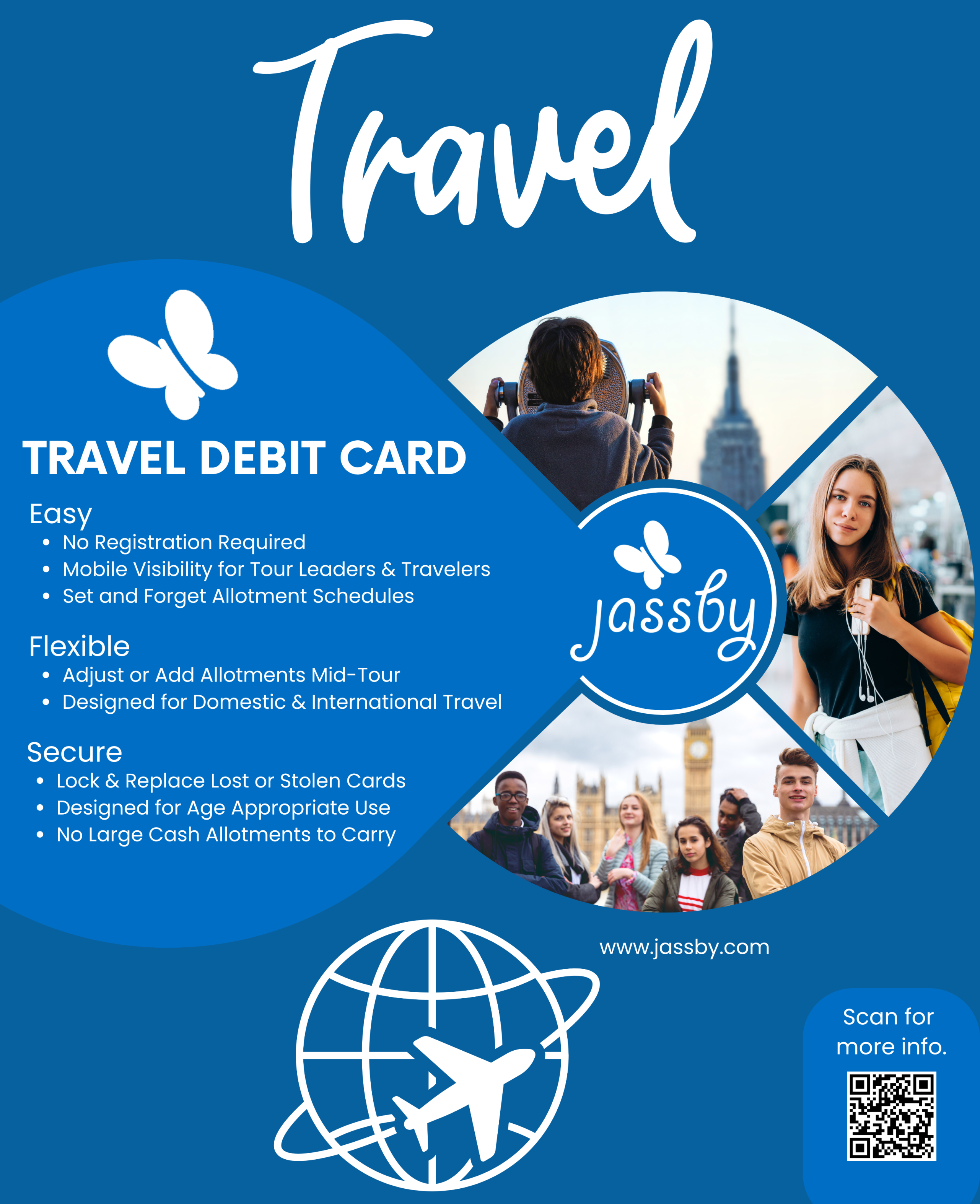
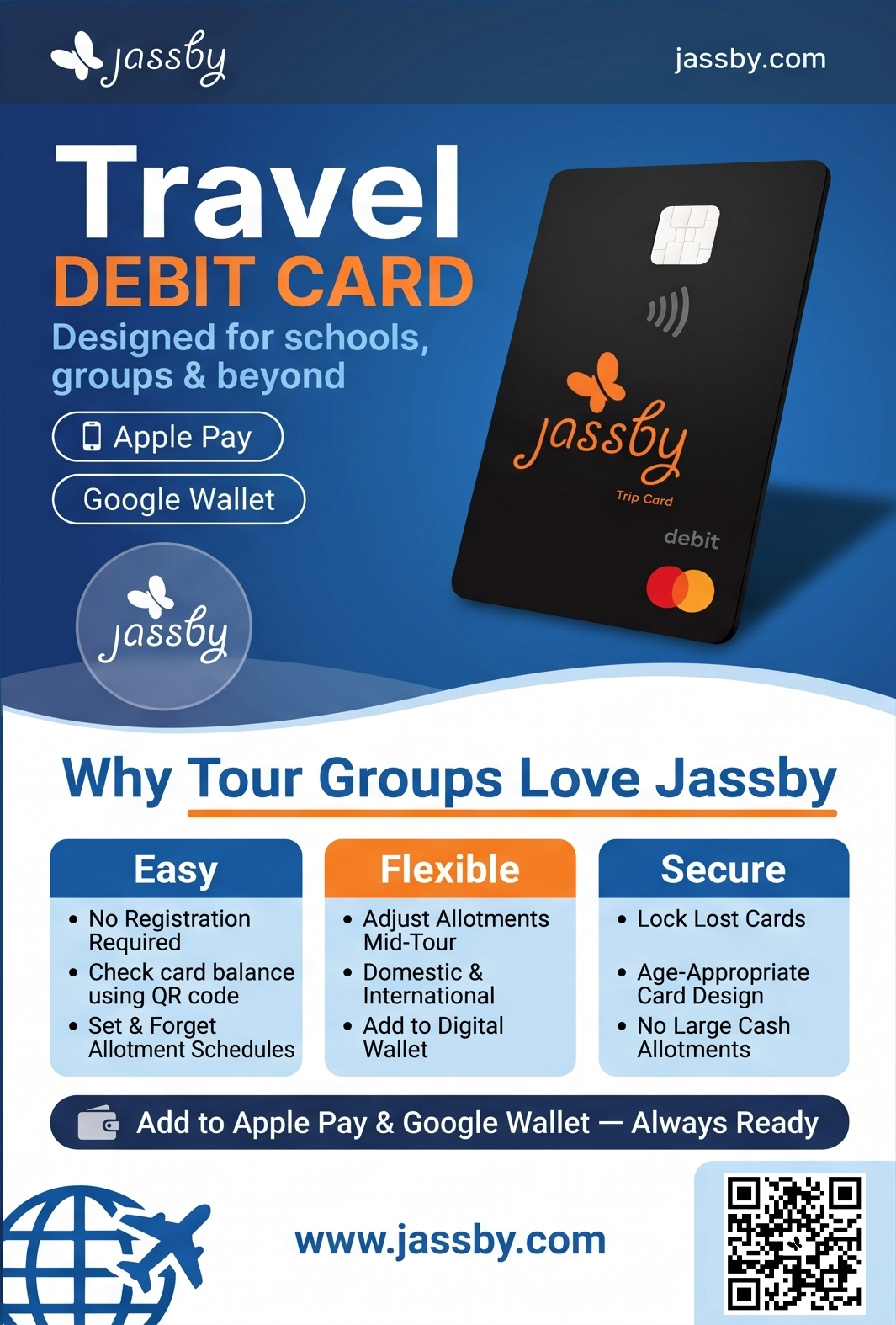
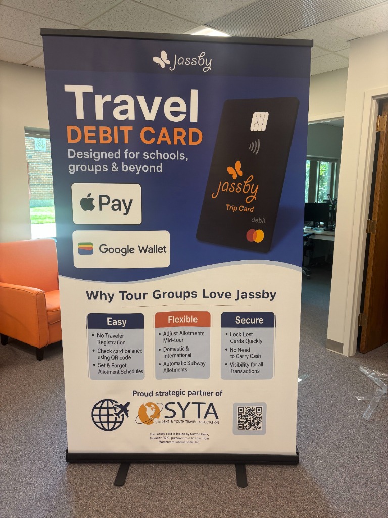
Beyond the B2B admin portal, I owned the physical Jassby Trip Card 3D product render and redesigned our conference and school-tour print collateral (Jassby Travel Banner Poster) for SYTA (Student & Youth Travel Association) partner events:
- Replacing stock-photo clutter with the physical product (
Current→Proposed→Latest): Our legacy print poster (Fig 4.1a) relied on a busy three-photo stock collage and buried the actual debit card and mobile wallet capabilities. - Putting the matte-black Trip Card & mobile wallets front and center: I created a high-resolution 3D matte-black leather-textured render of the Jassby Trip Card (
Fig 4.0) and restructured the print poster (Fig 4.1b&Fig 4.1c) around an immediate visual hierarchy: bold Travel DEBIT CARD typography, official Apple Pay and Google Wallet badges, a color-coded 3-column value breakdown (Easy · Flexible · Secure), and a high-contrast QR acquisition footer for tour operators.